Visualizing Our World's Tipping Point: Decoding CO₂ vs. Temperature Data Since 1960

CO₂ vs. Temperature Rise

CO₂ vs. Temperature Rise Header Image

Visualizing Our World's Tipping Point: Decoding CO₂ vs. Temperature Data Since 1960

The conversation around climate change has never been more urgent. From extreme weather events to shifting ecosystems, the signs are undeniable. Yet, amidst the cacophony of information, a clear, data-driven understanding remains paramount. For decades, scientists have meticulously tracked key indicators that paint a vivid picture of our planet's health. Among the most crucial of these are atmospheric CO₂ concentration and global temperature rise.

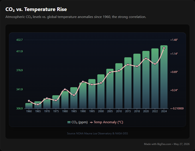
Imagine a tool that distills this complex scientific narrative into an easily digestible, visually compelling format. A resource that allows anyone – from students to seasoned researchers – to explore the undeniable correlation between these two critical metrics. Welcome to CO₂ vs. Temperature Rise, a powerful visualization tool designed to illuminate the relationship between atmospheric carbon dioxide levels and global average temperature changes since 1960.

This blog post will delve into the profound insights offered by this tool, guiding you through its features, demonstrating its utility, and explaining why an accessible understanding of this environmental data is not just important, but essential for our collective future. Prepare to see how data is beautiful when it tells the most critical story of our time.

CO₂ vs. Temperature Rise Chart

What is CO₂ vs. Temperature Rise?

The "CO₂ vs. Temperature Rise" tool is an intuitive and dynamic web-based platform that graphically presents the historical trend of two fundamental climate change indicators: the concentration of carbon dioxide in the Earth's atmosphere and the deviation of global average temperature from a baseline. Specifically, it focuses on data collected from 1960 onwards, a period characterized by accelerated industrial growth and a corresponding surge in anthropogenic emissions.

At its core, the tool serves as a visual correlator. It overlays two distinct data sets onto a unified timeline, allowing users to observe how changes in one metric often coincide with changes in the other. One axis typically represents atmospheric CO₂ concentration, measured in parts per million (ppm), a direct indicator of greenhouse gas levels. The other axis illustrates global mean temperature anomalies, typically shown as a difference from a long-term average (e.g., 1951-1980 average), quantifying the extent of global warming.

The scientific premise underpinning this tool is robust and widely accepted: the greenhouse effect. Carbon dioxide, along with other gases, traps heat within the Earth's atmosphere, preventing it from radiating back into space. As the concentration of these gases, particularly CO₂, increases, more heat is retained, leading to a rise in global average temperature. The period from 1960 is particularly significant because it marks a clear acceleration of these trends, with comprehensive and reliable data sets becoming readily available, making it an ideal timeframe to observe this critical relationship unfold.

This tool transforms raw scientific figures into an accessible narrative, making the often-abstract concept of climate change tangible. It allows users to visually track the relentless ascent of both CO₂ levels and global temperature, highlighting the compelling evidence of human impact on our planet's environment.

Key Features & Benefits of CO₂ vs. Temperature Rise

The true power of the "CO₂ vs. Temperature Rise" tool lies in its ability to translate complex scientific data into clear, actionable insights. Its carefully designed features are geared towards enhancing understanding, fostering education, and supporting informed decision-making.

Key Features:

  1. Dual-Axis Interactive Graph: The core feature is a dynamic graph displaying both atmospheric CO₂ concentration and global temperature anomaly on a shared timeline stretching from 1960 to the present. This dual-axis approach allows for direct visual comparison and identification of correlations.
  2. Historical Data Visualization (1960-Present): Provides access to decades of scientifically validated data, offering a robust historical context for understanding current trends. Users can observe the trajectory of both metrics over a significant period.
  3. Real-Time/Latest Data Integration: The tool incorporates the most recent available data for both CO₂ and temperature, ensuring that users are always working with up-to-date information, reflecting the ongoing changes in our environment.
  4. Trend Highlighting & Analysis: Sophisticated algorithms within the tool can automatically highlight significant trends, inflection points, and periods of rapid change in both CO₂ and temperature data, simplifying complex pattern recognition.
  5. Data Source Transparency: Information on the origin of the CO₂ (e.g., Mauna Loa Observatory) and temperature (e.g., NASA GISS, NOAA) data is readily available, ensuring credibility and allowing users to delve deeper into the raw scientific reports if desired.
  6. User-Friendly Interface: Designed with accessibility in mind, the interface is clean, intuitive, and requires no prior technical expertise to navigate. It prioritizes clarity and ease of exploration.
  7. Annotation and Explanatory Overlays: Contextual information might be available directly on the graph, such as major international climate agreements or significant global events, helping users understand the broader implications of observed data trends.
  8. Export/Share Options: Allows users to easily save graphs, specific data points, or share their findings with others, making it an invaluable resource for presentations, reports, and public awareness campaigns.

Benefits:

  • Enhanced Understanding of Climate Dynamics: By visually demonstrating the strong correlation between rising CO₂ and temperature, the tool demystifies the mechanics of climate change, making the science more accessible to a broad audience.
  • Empowering Education and Learning: It serves as an exceptional educational resource for students, teachers, and anyone seeking to grasp the fundamental drivers of global warming. The visual nature aids in retention and comprehension.
  • Fosters Data Literacy: Users develop a better understanding of how scientific data is collected, presented, and interpreted, promoting critical thinking about environmental information. The tool embodies the idea that data is beautiful when it informs.
  • Supports Informed Decision-Making: For policymakers, activists, and concerned citizens, the clear presentation of data provides a solid foundation for advocating for change, making personal choices, or shaping policy.
  • Facilitates Communication: The easily shareable visualizations provide compelling evidence that can be used to communicate the urgency and reality of climate change in a clear and impactful way, cutting through misinformation.
  • Saves Time on Data Aggregation: Users no longer need to scour multiple scientific databases to gather and cross-reference CO₂ and temperature data; the tool centralizes and presents it seamlessly.
  • Reveals Long-Term Trends: By covering a significant historical period, the tool helps users identify long-term patterns and the accelerating pace of both carbon emissions and global warming, offering perspective beyond short-term fluctuations.

In essence, "CO₂ vs. Temperature Rise" is more than just a graph; it's a window into the planet's changing vital signs, offering clarity and context to the most defining challenge of our era.

Step-by-Step Guide on How to Use CO₂ vs. Temperature Rise

Navigating the "CO₂ vs. Temperature Rise" tool is designed to be intuitive, allowing users to quickly access and understand the critical data without a steep learning curve. Here’s a simple guide to get you started:

Step 1: Accessing the Tool

  • Launch Your Browser: Open your preferred web browser (Chrome, Firefox, Edge, Safari, etc.).
  • Navigate to the Tool's URL: Enter the specific web address for the "CO₂ vs. Temperature Rise" tool into your browser's address bar and press Enter.

Step 2: Understanding the Interface at First Glance

Upon loading, you'll be greeted with the main interactive graph. Take a moment to observe its key components:

  • Central Graph Area: This is where the magic happens. You'll see at least two distinct lines or plots representing CO₂ concentration and global temperature rise.
  • X-Axis (Horizontal): This represents the timeline, typically spanning from 1960 to the most recent data available. Years will be clearly marked at regular intervals.
  • Y-Axes (Vertical): You'll notice two vertical axes, one on the left and one on the right.
    • Left Y-Axis (e.g., CO₂ Concentration): This will usually show atmospheric CO₂ levels, measured in parts per million (ppm).
    • Right Y-Axis (e.g., Temperature Anomaly): This will display global temperature anomalies, typically in degrees Celsius (°C) or Fahrenheit (°F), showing the deviation from a chosen baseline average.
  • Legend: A small box, usually in a corner, will define what each colored line or symbol on the graph represents (e.g., "Blue Line: CO₂ (ppm)", "Red Line: Temperature Anomaly (°C)").

Step 3: Interacting with the Data

The tool is built for exploration. Here’s how you can dig deeper:

  • Hovering for Specific Data Points: Move your mouse cursor over any point on either of the data lines. A tooltip should appear, displaying the exact year, CO₂ concentration (in ppm), and temperature anomaly (°C/°F) for that specific point in time. This is excellent for pinpointing exact values.
  • Zooming and Panning:
    • Zoom: Look for zoom controls, which might be buttons (+/-), a scroll wheel function (scroll up/down over the graph), or a click-and-drag box selection feature. Zooming allows you to focus on shorter periods, like a specific decade, to examine trends more closely.
    • Pan: If you've zoomed in, you might need to "pan" (click and drag the graph itself) to move horizontally across the timeline to view different sections of your zoomed-in period.
  • Resetting View: Most interactive graphs include a "Reset View" or "Home" button, which will return the graph to its original full-timeline display.

Step 4: Interpreting the Visuals

The primary goal is to observe the relationship between the two lines:

  • Parallel Trends: Notice how often the lines move in tandem. As the CO₂ line generally rises, observe the corresponding behavior of the temperature anomaly line.
  • Rate of Change: Pay attention to the steepness of the lines. A steeper line indicates a faster rate of increase. You'll likely observe a significant acceleration in both metrics post-1960, especially in recent decades.
  • Overall Correlation: The tool powerfully illustrates the overall positive correlation: as atmospheric carbon dioxide concentrations have increased, so too has the global average temperature.

Step 5: Utilizing Additional Features (If Available)

  • Data Source Information: Look for a section or link (often in the footer or a dedicated "About" section) that details the scientific sources of the data. This adds credibility and allows for further research.
  • Export/Share Options: If available, find buttons to download the graph as an image (PNG, JPG), save the underlying data, or share a direct link to the current graph view on social media or in an email. This is crucial for reports and presentations.
  • Contextual Information: Some versions of the tool might include clickable annotations or overlays that provide context for specific events or policy milestones on the timeline.

By following these steps, you can effectively leverage the "CO₂ vs. Temperature Rise" tool to gain a profound, data-driven understanding of climate change and its progression since 1960. It truly makes the often-abstract concept of environmental data accessible, demonstrating that data is beautiful when it empowers informed understanding.

Why You Need This Tool: Compelling Use Cases

The "CO₂ vs. Temperature Rise" tool isn't just an interesting visualization; it's a vital resource for a diverse range of individuals and organizations. Its ability to simplify complex data makes it indispensable for anyone looking to understand, teach, research, or communicate about climate change.

1. Educators and Students: Enhancing Climate Literacy

  • Classroom Engagement: Teachers can use the interactive graph to demonstrate the scientific evidence for climate change in real-time. Students can manipulate the data, observe trends, and discuss their findings, fostering deeper engagement than static charts.
  • Research Projects: For high school and university students, it provides a reliable, easy-to-access dataset for term papers, presentations, and scientific inquiries into carbon cycles, atmospheric science, and environmental studies.
  • Visualizing Abstract Concepts: The tool makes the abstract concepts of parts per million (ppm) and temperature anomalies tangible, helping students grasp the magnitude of changes in the environment.

2. Researchers and Scientists: Quick Insights and Data Validation

  • Initial Data Exploration: While not a primary research database, it serves as an excellent starting point for researchers to quickly visualize overall trends and confirm patterns before diving into more granular data analysis.
  • Contextual Overview: Scientists working on specific climate models or regional impacts can use the global trend data to provide context for their localized findings.
  • Presentation Aid: The high-quality visualizations are perfect for including in scientific presentations, papers, and conferences to quickly convey long-term trends to an audience.

3. Policymakers and Government Officials: Informing Strategic Decisions

  • Evidence-Based Policy Making: Clear, undeniable data on CO₂ and temperature provides a strong evidentiary basis for developing and implementing climate change mitigation and adaptation policies.
  • Public Briefings: The tool's easy-to-understand visuals are ideal for briefings with non-scientific stakeholders, helping policymakers communicate the urgency and rationale behind environmental legislation.
  • Tracking Progress (or Lack Thereof): By observing the trends, policymakers can evaluate the historical impact of past policies and understand the scale of effort still required.

4. Environmental Advocates and NGOs: Strengthening Campaigns

  • Public Awareness Campaigns: The compelling visual correlation between CO₂ and temperature provides powerful, irrefutable evidence for public advocacy campaigns, cutting through misinformation.
  • Stakeholder Engagement: NGOs can use the tool in discussions with corporations, government bodies, and communities to highlight the scientific basis for environmental initiatives and calls to action.
  • Educational Outreach: For community workshops and events, the interactive graph can serve as a focal point for explaining the science of climate change in an accessible manner.

5. Journalists and Communicators: Crafting Compelling Narratives

  • Data-Driven Storytelling: Journalists can integrate the tool's visualizations directly into articles, reports, and broadcasts to add scientific credibility and visual impact to their coverage of climate change.
  • Explaining Complex Issues: The simplified interface allows communicators to easily explain the intricate relationship between carbon emissions and global warming to a general audience.
  • Verification of Claims: It provides a quick reference point to verify claims about CO₂ levels or temperature trends, ensuring accuracy in reporting on the environment.

6. Concerned Citizens and Lifelong Learners: Personal Empowerment

  • Personal Understanding: Anyone interested in the health of our planet can use this tool to gain a clear, personal understanding of the scientific evidence behind climate change, empowering them to make informed choices.
  • Informed Discussions: It equips individuals with reliable data to participate in discussions about climate policy, sustainability, and environmental stewardship with confidence.
  • Connecting with the Data: For those who appreciate how data is beautiful when it reveals profound truths, this tool offers a direct and engaging way to connect with the scientific narrative of our changing world.

In every scenario, the "CO₂ vs. Temperature Rise" tool acts as a bridge, connecting raw scientific data with actionable understanding. It’s an essential resource for anyone striving to comprehend, communicate, or contribute to solutions for the defining challenge of our era.

Frequently Asked Questions (FAQ)

To ensure a comprehensive understanding and maximum utility of the "CO₂ vs. Temperature Rise" tool, here are answers to some commonly asked questions.

Q1: What are the primary data sources for the CO₂ and Temperature data?

A1: The data for atmospheric CO₂ concentration is typically sourced from reputable scientific institutions like the Mauna Loa Observatory (operated by NOAA and Scripps Institution of Oceanography), which provides the longest continuous record of direct atmospheric CO₂ measurements. Global temperature anomaly data usually comes from leading climate research centers such as NASA's Goddard Institute for Space Studies (GISS) or NOAA's National Climatic Data Center (NCDC), which compile and analyze temperature readings from thousands of stations worldwide, as well as satellite data. The tool aims for transparency and usually provides links or references to these original sources.

Q2: Why does the tool focus specifically on data "since 1960"?

A2: The year 1960 marks a crucial period for several reasons. Firstly, it falls squarely within the era of accelerated industrialization and a significant increase in anthropogenic (human-caused) carbon emissions following World War II. Secondly, reliable, continuous, and high-precision measurements of atmospheric CO₂ (e.g., from Mauna Loa, which began in 1958) and comprehensive global temperature records became widely available and standardized around this time. This timeframe provides a clear and robust dataset to observe the direct and accelerating correlation between rising CO₂ levels and global temperature increase, making it an excellent benchmark for understanding contemporary climate change.

Q3: What does "temperature anomaly" mean?

A3: A temperature anomaly is the difference from a long-term average, or "baseline" temperature. Instead of showing absolute temperatures, which vary widely by location and season, anomalies provide a more meaningful way to track changes in global temperature over time. For example, if the baseline average for a particular period was 14.0°C, and a given year recorded a global average of 14.5°C, the anomaly would be +0.5°C. This method helps to clearly illustrate warming or cooling trends and is a standard practice in climate change research because it minimizes noise from localized variations and focuses on the overall global shift.

Q4: Can I export or download the data or graphs from the tool?

A4: Most well-designed interactive data visualization tools, including this one, offer options to export the data or share the generated graphs. Look for buttons or icons typically labeled "Download," "Export," or "Share." You might be able to download the graph as an image file (e.g., PNG, JPEG) for use in presentations or reports, or even export the raw underlying data in formats like CSV for further personal analysis. These features significantly enhance the tool's utility for researchers, educators, and communicators.

Q5: Is this tool suitable for beginners or those without a scientific background?

A5: Absolutely. The "CO₂ vs. Temperature Rise" tool is specifically designed to be highly accessible and user-friendly. Its visual nature translates complex scientific data into an easily understandable format. The clear labeling, intuitive interaction (like hovering for data points), and straightforward presentation make it an excellent resource for anyone, regardless of their scientific background, who wants to grasp the fundamental relationship between carbon emissions and global warming. It empowers general users to engage with critical environmental data and reinforces the idea that data is beautiful when it is clear and informative.

Q6: How frequently is the data updated?

A6: The update frequency depends on the specific data sources and the tool's maintenance schedule. Typically, CO₂ data from observatories like Mauna Loa is updated monthly, with annual averages also compiled. Global temperature anomaly data is usually updated monthly or quarterly by major climate agencies. A well-maintained tool will strive to integrate the latest available data as frequently as possible to ensure users are always viewing the most current trends in climate change. Check the tool's "About" section or data source information for specific update schedules.

These FAQs aim to provide clarity and build confidence in using the "CO₂ vs. Temperature Rise" tool as a reliable and insightful resource for exploring the scientific evidence of climate change.

Concluding Thoughts on Understanding Our Warming World

The "CO₂ vs. Temperature Rise" tool offers an unparalleled opportunity to engage directly with the foundational data that underpins our understanding of climate change. By visually charting the parallel trajectories of atmospheric carbon dioxide concentrations and global average temperature since 1960, it provides a clear, undeniable perspective on humanity's impact on the planet's environment.

This resource is not merely a collection of numbers and lines; it is a powerful narrative, meticulously constructed from decades of scientific observation. It highlights how data is beautiful not just in its presentation, but in its profound capacity to inform, educate, and inspire action. For anyone seeking to move beyond abstract discussions and grasp the tangible realities of a warming world, this tool serves as an indispensable guide.

It empowers students to learn, educators to teach, researchers to validate, and citizens to understand. In a world grappling with the multifaceted challenges of climate change, tools like "CO₂ vs. Temperature Rise" are essential. They foster a data-driven approach, encouraging critical thinking and supporting informed decisions regarding the future of our planet. The insights gleaned from such a clear visualization equip individuals and communities alike to participate more effectively in the ongoing global dialogue and collective effort to address this defining challenge.