
COVID Global Cases

COVID Global Cases: Tracking the Pandemic in Numbers
COVID-19 generated massive datasets on cases, deaths, and regional spread. National reporting systems used different methodologies, updated on different schedules, and often conflicted with each other. A single, consolidated view of the pandemic's progression was hard to find.
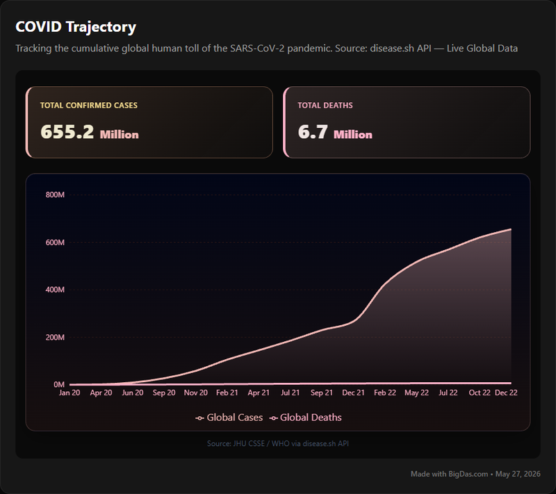
COVID Global Cases is a data aggregation and visualization tool that compiles cumulative global COVID-19 cases and deaths over time. It pulls from sources like the World Health Organization, national health ministries, and research institutions (notably Johns Hopkins University), then harmonizes the figures into a consistent framework with interactive dashboards.
This guide covers the tool's features, how to navigate it, and who uses it.
What is COVID Global Cases?
COVID Global Cases is an interactive platform for tracking the worldwide spread of COVID-19. It aggregates cumulative case and death counts, presents them through maps and charts, and allows users to drill down from the global level to individual countries.
The tool addresses a core problem with pandemic data: official figures reported by individual nations use different methodologies and update cadences. COVID Global Cases consolidates these disparate sources, cleans the data, and presents it in a unified interface.
For researchers, journalists, and the general public, it serves as a historical record of the pandemic's progression, updated to reflect the latest available figures.
Key Features & Benefits
1. Interactive Global Map and Dashboard
Feature: A world map color-coded by case load or death toll, with a dashboard showing global cumulative totals. Benefit: Immediate overview of geographic distribution. Hotspots are visible at a glance; users can click into specific regions for details.
2. Cumulative and Daily Metrics
Feature: Tracks both cumulative totals (total cases, total deaths, total recoveries) and daily new reported figures. Benefit: Cumulative numbers show overall burden; daily numbers show trajectory and the speed of spread. Both are needed to understand whether the situation is improving or worsening.
3. Historical Data and Trendlines
Feature: Historical data from the start of the pandemic, with customizable graphs. Linear and logarithmic scale options are available. Benefit: Researchers and analysts can trace the evolution of the pandemic, identify peaks, and compare growth rates across periods. Logarithmic scales are particularly useful for visualizing exponential growth phases.
4. Country-Specific and Regional Breakdowns
Feature: Drill down from global to country-level data; in larger nations, state or provincial data is often available. Benefit: Localized insights for public health officials, travelers, and anyone monitoring a specific region.
5. Data Visualization Options
Feature: Bar charts, line graphs, choropleth maps, and sometimes heatmaps or scatter plots. Benefit: Different chart types highlight different aspects of the data. Visual variety also makes prolonged analysis less tedious.
6. User-Friendly Interface
Feature: Intuitive layout, clear navigation, straightforward interactive elements. Benefit: Accessible to non-specialists. No training required to find basic country statistics.
7. Credible Data Sourcing and Regular Updates
Feature: Aggregates from WHO, national health ministries, and academic institutions. Daily updates. Benefit: Reliability. Users can trust that figures reflect the most current official reporting.
Step-by-Step Guide
Step 1: Access the Platform
Navigate to the COVID Global Cases website. The landing page displays a global dashboard with:
- An interactive world map showing case and death distribution
- Large summary numbers for total cumulative cases and deaths worldwide
- Daily new cases and deaths
Step 2: Read the Global Overview
The world map uses color intensity to indicate case load or death toll; a legend explains the scale. Hover over any country to see a tooltip with that country's cumulative cases, deaths, and recent daily changes.
Step 3: Explore Country-Specific Data
Click a country on the map, or use the search bar/dropdown menu to select one. The country dashboard shows:
- Cumulative and daily statistics for cases, deaths, and recoveries
- Historical trend graphs showing progression over time
- Per capita data (cases per 100,000 people) in some versions, which allows fairer comparison between countries of different sizes
Step 4: Use Filters and Timeframes
Most graphs include controls to adjust the time range: "Last 7 Days," "Last 30 Days," "All Time," or a custom date picker. You can typically toggle metrics on or off (e.g., show only Cases or only Deaths).
For trend graphs, note the scale option:
- Linear scale: Shows absolute numbers and overall growth.
- Logarithmic scale: Shows growth rates, useful during exponential phases or when comparing countries with very different case counts.
Step 5: Interpret the Data
Read the curve shape: steep rises indicate rapid spread; plateaus suggest control measures are working; declines indicate recovery. Keep in mind that spikes can reflect reporting backlogs or methodology changes rather than actual surges. Data updates daily; check the timestamp to confirm freshness.
Step 6: Advanced Features
Depending on the version, the tool may offer:
- Data export (CSV, Excel) for personal analysis
- Comparison tools to plot multiple countries on the same graph
Who Uses This Tool
Public Health Researchers and Epidemiologists
Tracking disease progression, analyzing outbreak patterns, and studying the effectiveness of interventions like lockdowns or vaccination campaigns. The platform saves time otherwise spent aggregating data from national sources.
Journalists and Media Professionals
Reporting on pandemic impact, creating data-driven visuals, and fact-checking claims about COVID statistics. Quick access to reliable figures improves accuracy and speed.
Policymakers and Government Officials
Informing decisions on travel restrictions, economic aid, and hospital resource allocation. Comparing national data with global trends helps assess policy effectiveness.
Educators and Students
A live case study for courses in global health, epidemiology, statistics, or data visualization. Students can interact directly with real pandemic data.
International Organizations and NGOs
Coordinating global health initiatives, assessing humanitarian needs, and guiding aid distribution. A unified dataset supports strategic decision-making.
Concerned Citizens
Staying informed about local or global conditions, planning travel, or cutting through conflicting news reports. Accessible data reduces reliance on secondhand summaries.
FAQ
Q1: What are the primary data sources?
The platform aggregates from the World Health Organization (WHO), national health ministries (e.g., CDC, PHE, RKI), and academic institutions like Johns Hopkins University. All sources are official or widely accepted authorities.
Q2: How often is the data updated?
Typically daily. The exact schedule depends on source-country reporting and processing time. Most dashboards display a "last updated" timestamp.
Q3: Is the data completely accurate?
The platform aims for the highest accuracy possible given official sources, but global COVID data has inherent limitations:
- Reporting delays vary by country
- Testing capacity affects case counts
- Definitions of "case" or "COVID-related death" differ between nations
- Data reconciliation sometimes revises historical figures
The data represents the best available official information and should be interpreted with these constraints in mind.
Q4: Can I view data for specific regions or states within a country?
For many larger countries, yes, down to the state or provincial level. This depends on whether national health authorities publish sub-national data.
Q5: How far back does the historical data go?
Typically to early 2020, covering the pandemic from its emergence onward.
Q6: Does the platform include data on vaccinations or recovery rates?
The core focus is cases and deaths, but many versions also include vaccination doses, coverage, and recovery numbers. When available, these are labeled and integrated into the dashboards.
Q7: Is COVID Global Cases free to use?
Yes. Public health data platforms of this type are generally free to maximize accessibility.
Summary
COVID Global Cases consolidates fragmented national reporting into a single, navigable view of the pandemic. It provides cumulative and daily metrics, historical trendlines, country-level breakdowns, and multiple visualization options, all sourced from authoritative organizations and updated regularly.
The tool is useful for anyone who needs reliable pandemic data: researchers building models, journalists verifying figures, policymakers allocating resources, educators teaching data literacy, or individuals seeking accurate information. By harmonizing disparate sources and presenting them clearly, it turns a difficult-to-interpret global dataset into something usable.