Understanding Global Disease Burden: Deciphering Two Decades of Shifting Mortality Trends (2000 vs. 2019)

Global Disease Burden

Global Disease Burden Header Image

Understanding Global Disease Burden: Deciphering Two Decades of Shifting Mortality Trends (2000 vs. 2019)

The story of humanity is intertwined with its struggles against disease and the continuous quest for better health. For millennia, understanding what causes us harm, how these threats evolve, and where they impact us most has been a cornerstone of survival and progress. In an increasingly interconnected world, deciphering global health patterns is not just an academic exercise; it's a critical imperative for policymakers, researchers, healthcare providers, and indeed, every global citizen.

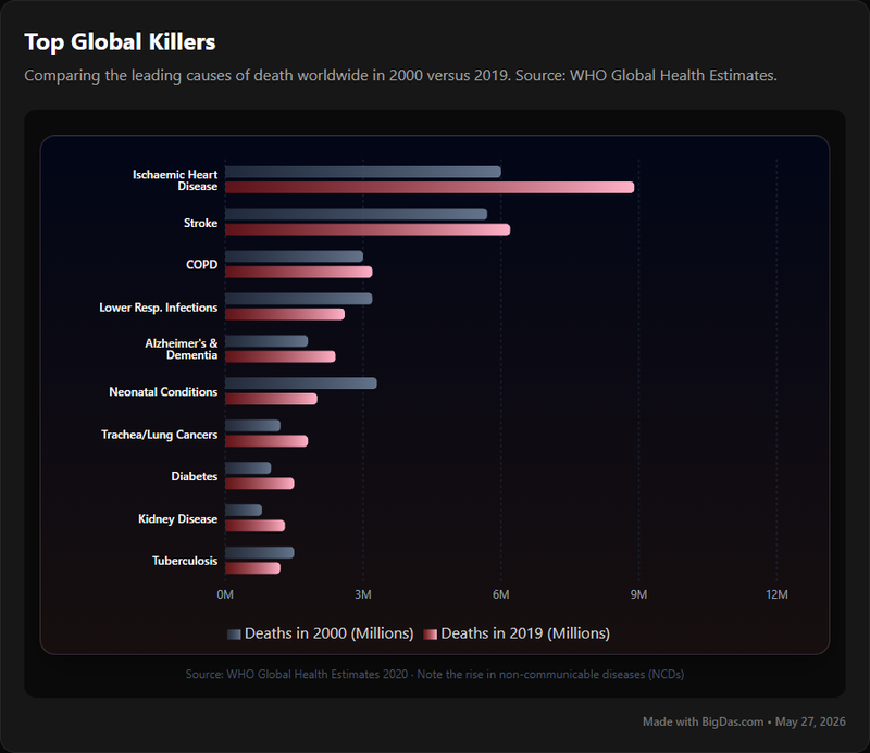
Imagine a powerful lens that allows you to peer into the health landscape of our planet, not just at a single moment, but across significant spans of time. A tool that distills vast amounts of complex data into understandable, actionable insights, revealing the silent shifts in the battle between life and death. This is precisely the capability offered by the Global Disease Burden tool, a vital resource designed to illuminate the top causes of death globally, specifically contrasting the years 2000 and 2019.

This comprehensive guide will explore the profound utility of this tool, demonstrating how it transcends mere statistics to offer a compelling narrative of global health transformation. We’ll delve into its features, guide you through its use, and illustrate why its insights are indispensable for anyone seeking a deeper understanding of human mortality and the ever-evolving disease landscape. For those who appreciate when data is beautiful and profoundly impactful, this resource is a revelation.

Global Disease Burden Chart

What is Global Disease Burden? Unpacking the Concept

The term "Global Disease Burden" refers to the impact of a health problem in an area, measured by financial cost, mortality, morbidity, or other indicators. It's a comprehensive approach that moves beyond simply counting deaths to quantify the overall health loss from diseases, injuries, and risk factors. This holistic perspective allows for a clearer understanding of how various conditions truly affect populations over time.

The specific tool we are exploring, titled "Global Disease Burden" and focusing on the comparison of 2000 vs. 2019, acts as an accessible, interactive dashboard or report. It's built upon extensive epidemiological data, often compiled and analyzed by leading global health organizations such as the World Health Organization (WHO) and its partners. Its primary function is to visualize and explain the leading causes of death across the globe, highlighting how these causes have changed over nearly two decades.

This comparison of two distinct years – 2000 and 2019 – is not arbitrary. It represents a significant temporal window, capturing a period of rapid globalization, technological advancement, socio-economic shifts, and concentrated efforts in public health. By presenting data from these two points, the tool allows users to identify trends, celebrate successes in combating certain diseases, and critically, pinpoint emerging or persistent challenges that demand urgent attention. It’s more than just a list; it’s a narrative of global health evolution.

The beauty of such a tool lies in its ability to condense incredibly complex global mortality statistics into digestible formats. Instead of sifting through thousands of pages of reports, users can quickly identify key patterns:

  • Which diseases have seen a significant reduction in their fatal impact?
  • Which non-communicable diseases (NCDs) are on the rise?
  • How do these trends vary across different regions or income levels?
  • What does this mean for future public health strategies?

By engaging with the "Global Disease Burden" tool, you’re not just looking at numbers; you’re engaging with the stories of millions of lives, understanding the forces that shape our collective health destiny.

Key Features & Benefits: Why This Tool Is Indispensable

The "Global Disease Burden" tool is engineered to provide clarity and insight into the complex world of global health statistics. Its design and functionality are centered around empowering users with accessible, high-impact data.

Key Features:

  1. Direct 2000 vs. 2019 Comparison: At its core, the tool offers a side-by-side or overlaid comparison of the top causes of death for two pivotal years: 2000 and 2019. This direct temporal contrast is crucial for identifying shifts and trends in global mortality.
  2. Global & Regional Perspectives: While providing a global overview, the tool often allows for granular exploration. Users can typically filter data by geographical regions (e.g., continents, income groups) to understand localized disease burdens.
  3. Categorization of Causes: Mortality causes are usually grouped into meaningful categories, such as communicable diseases, non-communicable diseases (NCDs), and injuries. This classification aids in understanding broader public health challenges.
  4. Interactive Visualizations: Leveraging the principle that data is beautiful and more digestible when visualized, the tool employs interactive charts, graphs (e.g., bar charts, treemaps, line graphs), and perhaps even maps. These visuals make complex statistical information immediately comprehensible.
  5. Trend Highlighting: Beyond showing static numbers, the tool is designed to highlight the changes between 2000 and 2019. This includes identifying causes that have increased significantly, decreased dramatically, or remained stubbornly prevalent.
  6. Underlying Data Access (Often): While presenting summarized visuals, many such tools offer options to view or download the raw data, allowing for deeper personal analysis or verification.

Benefits:

  1. Unveiling Shifting Health Priorities: The most significant benefit is the ability to clearly see how the global disease landscape has transformed. This insight is critical for re-evaluating public health priorities and resource allocation. For example, a decline in infectious diseases in some regions might be offset by a surge in non-communicable diseases.
  2. Informed Policy Making: For governments and international organizations like the WHO, the data presented is invaluable for evidence-based policy development. Understanding where mortality burdens are shifting helps in designing targeted interventions, healthcare infrastructure investments, and prevention programs.
  3. Enhanced Research & Academic Study: Researchers can use the tool to identify areas needing further investigation, validate hypotheses about health trends, and provide foundational data for academic papers and studies related to epidemiology and global health.
  4. Public Awareness & Education: The accessible format makes it easier for journalists, educators, and the general public to grasp complex health statistics. This fosters greater public awareness of major disease challenges and promotes informed discussions about global health strategies.
  5. Resource Allocation Optimization: Non-governmental organizations (NGOs) and aid agencies can leverage these insights to strategically allocate funding and resources to areas and disease categories where they are most urgently needed, ensuring maximum impact.
  6. Monitoring Progress & Identifying Gaps: By comparing 2000 and 2019, users can gauge the effectiveness of past global health initiatives. It helps in celebrating successes (e.g., reductions in certain communicable diseases) and identifying persistent gaps or new challenges that require innovative solutions.

In essence, the "Global Disease Burden" tool transforms raw numbers into a narrative of human health and struggle, making it an indispensable resource for anyone committed to understanding and improving the well-being of populations worldwide. It's a testament to how effectively visualized data is beautiful and powerful in driving positive change.

Step-by-Step Guide on How to Use the Global Disease Burden Tool

Navigating a powerful data visualization tool can seem daunting at first, but the "Global Disease Burden" tool is designed for intuitive exploration. While specific interfaces may vary slightly, the core steps to extract valuable insights remain consistent. Here’s a general guide to help you harness its full potential:

Step 1: Accessing the Tool

  • Locate the Official Source: Typically, such tools are hosted on the websites of major health organizations (like the WHO), research institutions, or dedicated data portals. A quick search for "Global Disease Burden 2000 vs 2019 WHO" or similar terms should lead you to the official resource.
  • Initial Landing Page: Upon reaching the tool, you'll likely be greeted by an overview or a main dashboard. Take a moment to familiarize yourself with the layout.

Step 2: Understanding the Interface and Core Views

  • Global Overview (Default): The tool usually defaults to a global summary, presenting the top causes of death for 2000 and 2019 side-by-side or on a single interactive chart.
  • Legend and Key: Pay attention to any legends or keys that explain colors, chart types, or abbreviations. For instance, disease categories might be color-coded.
  • Time Selector: Ensure you understand how the 2000 vs. 2019 comparison is presented. It might be two separate graphs, a toggle switch between years, or overlaid data points.

Step 3: Filtering and Drilling Down for Specific Insights

This is where the power of the tool truly shines.

  • Geographical Filters:
    • Region/Continent: Look for drop-down menus or clickable map regions to select specific continents (e.g., Africa, Europe, Asia) or broader regional groupings (e.g., high-income countries, low-income countries).
    • Country (if available): Some tools allow for drilling down to individual country data, offering even more localized insights into mortality patterns.
  • Cause Filters:
    • Disease Categories: You might be able to filter by broad categories like "Communicable diseases," "Non-communicable diseases (NCDs)," or "Injuries."
    • Specific Diseases: Some interfaces allow you to search for or select specific diseases (e.g., ischemic heart disease, stroke, HIV/AIDS, tuberculosis).
  • Demographic Filters (Less Common for Top Causes, but possible): Occasionally, you might find options to filter by age group or sex, though this is less common for high-level "top causes of death" summaries.

Example Action: To see the change in mortality from non-communicable diseases in Africa between 2000 and 2019, you would select "Africa" from the region filter and "Non-communicable diseases" from the cause category filter.

Step 4: Interpreting the Data and Visualizations

  • Identify Top Causes: Immediately note which diseases or conditions consistently appear at the top of the mortality lists for both 2000 and 2019, globally or in your selected region.
  • Observe the Shifts: This is critical.
    • Increases: Which causes have climbed higher on the list or show significantly larger absolute numbers in 2019 compared to 2000? These are often emerging or escalating health challenges.
    • Decreases: Which causes have fallen or show smaller numbers? These represent areas of success in public health interventions.
    • Persistence: Are there any causes that remain stubbornly high in both years, indicating ongoing major disease burdens?
  • Look for Proportional Changes: Sometimes, a disease might not top the list but show a dramatic proportional increase, signaling a rapidly growing problem.
  • Utilize Tooltips: Hover your mouse over charts, bars, or data points. Most interactive tools provide tooltips that display exact numbers, percentages, or additional context, making the data beautiful and easily understandable.

Step 5: Extracting and Sharing Insights

  • Screenshot/Download Charts: If you need to include the visuals in a report or presentation, most tools allow for easy downloading of images or embedding of charts.
  • Download Data (if available): For in-depth analysis, look for options to download the raw data in formats like CSV or Excel.
  • Share Functionality: Many online tools include a 'share' button that generates a unique URL for your specific filtered view, making it easy to share your findings with colleagues or students.

By following these steps, you can effectively navigate and extract meaningful insights from the "Global Disease Burden" tool, turning raw data into compelling narratives about global health and mortality trends.

Why You Need This Tool: Crucial Use Cases

The "Global Disease Burden" tool, with its focus on 2000 vs. 2019 mortality trends, serves a diverse audience across various sectors. Its insights are not merely interesting statistics; they are critical foundations for action, strategy, and understanding in the complex world of global health.

1. For Public Health Officials and Policymakers (WHO, National Health Ministries)

  • Evidence-Based Policy Development: Provides concrete data on the leading causes of death and their shifts, informing decisions on national and international health strategies, resource allocation, and legislative initiatives.
  • Program Evaluation: Helps assess the impact of past health campaigns and interventions. For instance, a decline in mortality from a specific infectious disease might indicate the success of vaccination programs, while a rise in NCDs points to the need for preventative lifestyle campaigns.
  • Future Planning: Identifies emerging disease threats or persistent burdens, enabling proactive planning for healthcare infrastructure, medical training, and public health emergency preparedness. It helps answer: "Where should our next dollar of health investment go?"

2. For Researchers and Academics (Epidemiologists, Social Scientists)

  • Identifying Research Gaps: Pinpoints areas where the disease burden is high or rapidly increasing, signaling the need for more focused research into causes, treatments, and prevention strategies.
  • Trend Analysis and Hypothesis Generation: Offers a rich dataset for analyzing long-term health trends, developing hypotheses about underlying socio-economic or environmental factors, and understanding demographic impacts on mortality.
  • Comparative Studies: Facilitates comparative analysis between different regions, income groups, or even specific diseases, contributing to a broader understanding of global health disparities.

3. For Healthcare Providers and Medical Professionals

  • Understanding Patient Demographics: Helps clinicians understand the broader disease landscape that affects their patient populations, informing preventative care recommendations and treatment priorities.
  • Advocacy for Resources: Provides data to advocate for increased resources, specialized training, or public health initiatives targeting prevalent or rising causes of death in their communities.
  • Educational Context: Offers valuable context for medical students and residents, illustrating the real-world impact of various diseases on a global scale.

4. For Journalists and Communicators

  • Informed Reporting: Enables journalists to report accurately and with greater depth on global health issues, moving beyond anecdotal evidence to present a data-driven narrative of disease challenges and progress.
  • Creating Compelling Stories: The vivid comparison of 2000 vs. 2019 lends itself to powerful storytelling. When data is beautiful and well-explained, it can capture public attention and foster greater engagement with critical health topics.
  • Public Education: Facilitates the translation of complex epidemiological data into accessible articles, infographics, and broadcasts that educate the public on major mortality threats and the importance of public health initiatives.

5. For Educators and Students

  • Teaching Global Health: Provides a dynamic and practical resource for teaching concepts related to epidemiology, demography, public health policy, and global disease patterns.
  • Project and Assignment Support: Students can use the tool to conduct research for projects, analyze real-world data, and develop critical thinking skills about global health challenges.
  • Visual Learning: The interactive nature and clear visualizations make it an excellent tool for visual learners to grasp complex mortality statistics.

6. For Non-Governmental Organizations (NGOs) and Humanitarian Aid Groups

  • Targeted Interventions: Helps NGOs identify regions and disease areas most in need of their services, allowing for more strategic and impactful aid delivery.
  • Funding and Grant Applications: Provides strong evidence to support funding requests, demonstrating the scale of the problem and the potential impact of their proposed interventions.
  • Advocacy Campaigns: Offers data to bolster advocacy efforts for specific health issues, mobilizing public support and influencing policy change.

In summary, the "Global Disease Burden" tool is far more than a statistical archive. It's a strategic compass for navigating the challenges of global health, enabling diverse stakeholders to make informed decisions, drive impactful actions, and ultimately contribute to a healthier world.

Frequently Asked Questions (FAQ)

To further clarify the utility and scope of the "Global Disease Burden" tool, here are answers to some common questions:

Q1: What exactly does "Global Disease Burden" mean?

A1: "Global Disease Burden" refers to the comprehensive impact of diseases, injuries, and risk factors on a population's health. It goes beyond simple death counts to also quantify years of healthy life lost due to disability (YLD) and years of life lost due to premature mortality (YLL). The combination of YLDs and YLLs gives a measure called Disability-Adjusted Life Years (DALYs), which is a common metric used in broader GBD studies. This specific tool focuses primarily on causes of death but is rooted in the larger GBD methodology.

Q2: Who compiles and maintains the data for this tool?

A2: While the description for this specific tool is general, global disease burden data is typically compiled and analyzed by leading international health organizations. The World Health Organization (WHO) and the Institute for Health Metrics and Evaluation (IHME) are prominent entities that regularly publish extensive Global Burden of Disease (GBD) studies, often in collaboration with numerous global partners and researchers. It's highly likely this tool leverages data from such authoritative sources.

Q3: Why compare 2000 and 2019 specifically?

A3: The years 2000 and 2019 offer a significant and illustrative timeframe. 2000 often serves as a baseline for many Millennium Development Goals (MDGs) and early 21st-century health initiatives. 2019, being the year immediately preceding the global COVID-19 pandemic, provides a snapshot of the global health landscape before the pandemic significantly altered mortality and morbidity patterns worldwide. This nearly two-decade span allows for the identification of major long-term shifts in disease prevalence and mortality.

Q4: What kind of data does the tool cover? Is it just deaths?

A4: The description specifies "Top causes of death globally." Therefore, the primary data presented will be related to mortality statistics. This includes the number of deaths attributable to various diseases, injuries, and conditions. While the broader Global Burden of Disease framework includes measures of disability (YLDs), this tool's explicit focus is on mortality.

Q5: Can I see data for specific countries or only global averages?

A5: Most sophisticated "Global Disease Burden" tools, especially those providing insights into mortality trends, offer the ability to drill down beyond global averages. While the default view might be global, look for interactive filters, maps, or drop-down menus that allow you to select specific continents, regions (e.g., income-based groupings), and often individual countries. This enables a more nuanced understanding of localized disease burdens.

Q6: How often is the data updated?

A6: For studies comparing specific years like 2000 and 2019, the data for those years remains static. However, the overarching Global Burden of Disease studies from which this tool likely draws its information are updated periodically (e.g., every few years or annually for specific indicators) to reflect the most current estimates of health loss. New versions of similar comparison tools might be released with updated year ranges in the future.

Q7: Is the "Global Disease Burden" tool free to use?

A7: Tools and data portals provided by major health organizations like the WHO or research institutions like IHME are typically made publicly available and free to use. Their mission often involves disseminating health information for public benefit, research, and policy-making. Always verify the source to ensure you are accessing an official, reliable, and free resource.

Q8: How accurate is the data presented?

A8: The data in such tools is derived from extensive epidemiological research, national vital statistics, surveys, and scientific literature. While all epidemiological data involves estimations and models, organizations like WHO and IHME employ rigorous methodologies and robust peer-review processes to ensure the highest possible accuracy and reliability. The data represents the best available scientific estimates of global mortality burdens.


Conclusion: A Clearer Vision for Global Health

The "Global Disease Burden" tool, comparing the top causes of death between 2000 and 2019, offers an unparalleled window into the shifting landscape of global health. It moves beyond mere statistics, presenting a compelling narrative of human progress, persistent challenges, and evolving disease patterns. This resource provides critical insights into how our world's mortality profile has transformed over two pivotal decades.

By engaging with this tool, users gain a profound understanding of which health battles are being won, where new fronts are emerging, and where the most significant disease burdens continue to weigh heavily on populations. Whether you are a public health professional seeking to inform policy, a researcher exploring new avenues of inquiry, an educator bringing complex data to life for students, or simply an engaged citizen curious about the forces shaping global well-being, this tool is an invaluable asset.

It stands as a testament to the power of well-organized data and the principle that data is beautiful when it illuminates complex truths. The ability to clearly visualize the trajectory of mortality from 2000 to 2019 provides not just historical context, but also a forward-looking perspective, empowering us all to contribute to more informed decisions and a healthier future for everyone.