
Global Temperature Anomaly

Understanding Our Warming World: A Deep Dive into the Global Temperature Anomaly

Unveiling the Earth's True Temperature Story: Why Global Temperature Anomaly Data from NASA is Crucial for Understanding Climate Change
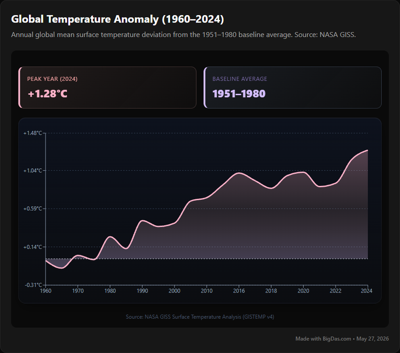
In an era defined by growing environmental concerns, the ability to accurately monitor and understand our planet's health has never been more critical. At the forefront of this understanding lies a fundamental metric: the Global Temperature Anomaly. Far more insightful than simple absolute temperatures, the Global Temperature Anomaly provides a precise, universally comparable measure of how much our planet's surface temperature deviates from a historical norm. It is the heartbeat monitor of our Earth, offering an unequivocal signal of global warming and the profound changes underway in our climate.
This powerful concept, meticulously tracked and presented by institutions like NASA, transforms complex temperature data into clear, actionable insights. For anyone seeking to genuinely grasp the trajectory of our environment – from seasoned scientists and policymakers to educators, students, and engaged citizens – comprehending and utilizing tools that present this anomaly data is indispensable. This guide will demystify the Global Temperature Anomaly, explore its features and benefits, provide a step-by-step approach to interpreting it, highlight its diverse applications, and answer your most pressing questions. Prepare to see why, in the realm of climate science, this data is beautiful in its clarity and undeniable truth.
What is Global Temperature Anomaly?
At its core, a "temperature anomaly" refers to the difference between the observed temperature and a long-term average (or baseline) for a specific location and time period. When we talk about the Global Temperature Anomaly, we're extending this concept to encompass the entire Earth's surface, reflecting how much the average global temperature deviates from a pre-defined historical baseline.
The baseline period most commonly used by scientific bodies like NASA's Goddard Institute for Space Studies (GISS) is the 1951 to 1980 average. But why this specific period, and why anomalies instead of absolute temperatures?
Why a Baseline? Measuring absolute global average temperature is challenging due to varying measurement techniques, instrument calibration issues, and the vast geographical spread of monitoring stations. Furthermore, regional temperatures fluctuate dramatically from day to day and year to year due to natural weather patterns. A cold winter in one region might be offset by a warm summer in another, making a simple absolute average less indicative of a long-term trend.
By focusing on anomalies, scientists can effectively:
- Account for Variations: Anomalies standardize data from different regions. A temperature anomaly of +1°C means the temperature was 1 degree warmer than the local average for that time of year, regardless of whether that average was 10°C or 30°C. This allows for meaningful comparisons across diverse climates.
- Highlight Trends: When an entire globe consistently shows positive temperature anomalies, it's a clear signal of warming, even if individual regions experience temporary cold snaps. This method smooths out short-term fluctuations to reveal underlying climate trends.
- Facilitate Comparison: Using a consistent baseline (like 1951-1980) allows for direct comparison of warming or cooling trends across decades and centuries, providing a robust historical context for current observations. The 1951-1980 period is chosen because it represents a relatively stable climatic period before the most significant anthropogenic global warming began to manifest broadly.
In essence, the Global Temperature Anomaly is a powerful statistical tool that cuts through the noise of daily weather variations to reveal the unmistakable long-term changes occurring in our planet's environment. It is the most reliable indicator we have for tracking the progression of global warming.
Key Features & Benefits of Global Temperature Anomaly Data Tools
While "Global Temperature Anomaly" is a concept, it is brought to life through sophisticated data visualization and analysis tools, often provided by organizations like NASA and NOAA. These platforms are designed to make complex climate data accessible and understandable. Here are the key features you'd typically find and the invaluable benefits they offer:
Key Features:
- Interactive Time-Series Graphs:
- Feature: Visual representation of global temperature anomalies over decades or centuries, typically showing annual, seasonal, or monthly averages. Often includes error bars and smoothing functions to highlight trends.
- Benefit: Provides immediate visual understanding of temperature trends, making it easy to see the upward trajectory associated with global warming. The "data is beautiful" when complex information is presented so clearly, allowing for quick pattern recognition and historical context.
- Geographical Anomaly Maps:
- Feature: World maps color-coded to show regional temperature anomalies (warmer or colder than average) for specific periods. These often include dynamic sliders to view changes over time.
- Benefit: Helps visualize the uneven distribution of warming across the globe, illustrating that while the global average is rising, specific regions might warm faster or experience localized anomalies. This helps connect abstract climate concepts to tangible geographical impacts.
- Customizable Baseline Selection:
- Feature: Some advanced tools allow users to select different baseline periods (e.g., 1880-1920, 1981-2010) to observe how the anomaly changes relative to various historical contexts.
- Benefit: Offers deeper analytical flexibility for researchers and students, enabling them to test hypotheses about different stages of climate change or focus on specific historical shifts.
- Data Export Capabilities:
- Feature: Option to download raw or processed anomaly data in various formats (CSV, Excel) for independent analysis.
- Benefit: Empowers researchers, educators, and data journalists to conduct their own analyses, integrate the data into their own models, or create custom visualizations, fostering transparency and broader scientific engagement.
- Transparency and Source Information:
- Feature: Clear documentation of data sources (e.g., land stations, ocean buoys, satellite data), methodologies for processing, and links to original research papers.
- Benefit: Builds trust and credibility, allowing users to understand the scientific rigor behind the numbers and promoting scientific literacy regarding climate data.
- Educational Resources and Explanations:
- Feature: Integrated definitions, contextual information about climate science, and explanations of how to interpret the data.
- Benefit: Makes the tool accessible to a broader audience, from students to concerned citizens, turning complex scientific information into an understandable narrative about our environment.
Overarching Benefits:
- Undeniable Evidence of Global Warming: The most significant benefit is providing clear, compelling, and consistent evidence of the Earth's warming trend, helping to counter misinformation and drive informed discussions about climate change.
- Informed Decision-Making: For policymakers, this data is crucial for developing effective mitigation and adaptation strategies, as it quantifies the scale and pace of temperature changes.
- Enhanced Scientific Literacy: By presenting complex data in an engaging and accessible way, these tools contribute to a more scientifically literate public, fostering greater understanding of environmental issues.
- Empowerment for Action: Understanding the magnitude of the Global Temperature Anomaly can motivate individuals and communities to take action, whether through personal changes, advocacy, or supporting sustainable initiatives.
Step-by-Step Guide on How to Use and Interpret Global Temperature Anomaly Data
Accessing and interpreting Global Temperature Anomaly data is straightforward once you understand the core concepts. We'll use the example of NASA's GISS Surface Temperature Analysis (GISTEMP), a leading source for this information, to illustrate the process.
Step 1: Accessing the Data Portal
- Action: Navigate to reputable scientific websites that host this data. The most prominent example is the NASA GISS website (data.giss.nasa.gov/gistemp/). Other sources include NOAA's National Centers for Environmental Information (NCEI) or the UK Met Office Hadley Centre (HadCRUT data).
- What to Look For: You'll typically find a main dashboard or a series of links leading to different data visualizations and downloads.
Step 2: Understanding the Primary Visualizations
The Global Mean Annual Temperature Anomaly Graph:
- Action: This is usually the first graph you'll encounter. It plots global average temperature anomalies for each year since records began (e.g., 1880) against the chosen baseline (e.g., 1951-1980).
- Interpretation:
- Y-axis: Represents the temperature anomaly in degrees Celsius (°C) or Fahrenheit (°F). A value of +0.5°C means the global average for that year was 0.5°C warmer than the 1951-1980 average. A value of -0.2°C means it was 0.2°C colder.
- X-axis: Represents the year.
- Baseline (Zero Line): The horizontal line at 0 on the y-axis signifies the average temperature for the baseline period.
- Trends: Observe the overall pattern. A consistent upward trend, especially in recent decades, is a clear indicator of global warming. Notice how most years before the mid-20th century tend to be below the zero line, while most years after are above it, with increasing magnitude.
- Fluctuations: You'll see year-to-year variations. These are natural climatic variations (like El Niño/La Niña cycles) superimposed on the long-term warming trend. Don't let short-term dips obscure the overarching pattern.
The Global Temperature Anomaly Map (often called a "Heat Map" or "Anomaly Map"):
- Action: Look for interactive maps that show regional temperature anomalies. These often allow you to select specific months, seasons, or years.
- Interpretation:
- Color Scale/Legend: This is crucial. Typically, warm colors (reds, oranges) indicate regions warmer than their local average for that period, while cool colors (blues) indicate colder-than-average regions. The intensity of the color usually corresponds to the magnitude of the anomaly.
- Geographic Patterns: Observe which parts of the world are warming fastest. The Arctic, for instance, consistently shows some of the highest positive anomalies, a phenomenon known as Arctic amplification. This illustrates the varied impact of climate change globally.
- Temporal Comparison: If the map is interactive, use sliders or selectors to view how regional anomalies have changed over different periods (e.g., comparing 1980 vs. 2020).
Step 3: Utilizing Interactive Features
- Adjusting Time Scales: Most tools allow you to zoom in on specific decades or view monthly/seasonal data to analyze shorter-term variations or specific events.
- Changing Baselines (if available): Experiment with different baseline periods to see how the perceived anomaly shifts. While the absolute change remains the same, the reference point alters the magnitude of the anomaly. This is an advanced feature for deeper analysis.
- Data Download: For personal projects or deeper analysis, look for buttons that allow you to download the underlying data. This enables you to create your own visualizations or integrate the data into other models.
Step 4: Drawing Conclusions and Contextualizing
- Overall Trend: The most important takeaway is the long-term trend. The consistent positive shift in global temperature anomalies, especially since the late 20th century, provides compelling evidence of human-induced global warming.
- Connecting to Impacts: Consider how these temperature changes relate to observed environmental impacts: rising sea levels, extreme weather events, glacial melt, changes in ecosystems.
- Source and Reliability: Always note the source of the data (NASA, NOAA, etc.) and understand their methodologies. This reinforces the scientific validity of your observations.
By following these steps, you can effectively navigate and interpret Global Temperature Anomaly data, transforming raw numbers into a clear, understandable narrative about our changing climate and the urgent need to address global warming. The precision of this data is beautiful in its capacity to inform and enlighten.
Why You Need This Tool: Crucial Use Cases for Global Temperature Anomaly Data
The Global Temperature Anomaly isn't just a scientific curiosity; it's a vital diagnostic tool with far-reaching implications. Its data empowers diverse groups to understand, analyze, and respond to the challenges of climate change. Here are some key use cases:
1. For Researchers and Scientists:
- Climate Model Validation: Scientists use observed temperature anomaly data to test and validate the accuracy of their climate models, ensuring that simulations of future warming are robust.
- Attribution Studies: This data is fundamental for attributing specific temperature changes to natural variability versus human-induced factors, distinguishing the signal of global warming from background noise.
- Regional Impact Studies: By examining localized anomaly maps, researchers can study specific regional warming trends (e.g., Arctic amplification) and their unique environmental consequences.
- Historical Climatology: Analyzing long-term anomaly trends helps reconstruct past climates and understand the natural range of temperature variability.
2. For Educators and Students:
- Teaching Climate Science: Visualizing the Global Temperature Anomaly makes abstract concepts like global warming tangible and understandable for students of all levels. It provides undeniable graphical evidence.
- Project-Based Learning: Students can use freely available NASA or NOAA anomaly data to conduct their own analyses, create presentations, or even contribute to citizen science projects, fostering critical thinking and data literacy.
- Debunking Misinformation: Educators can use the clear, authoritative data to address common misconceptions about climate change, demonstrating the scientific consensus through irrefutable evidence.
3. For Policymakers and Government Agencies:
- Informing Climate Policy: Quantifying the rate and magnitude of global warming through anomaly data is essential for setting emissions targets, developing adaptation strategies, and participating in international climate negotiations.
- Resource Allocation: Understanding which regions are experiencing the most significant warming helps prioritize resources for disaster preparedness, infrastructure upgrades, and support for vulnerable communities.
- Public Health Planning: Temperature anomalies have direct links to public health, influencing heatwave frequency, vector-borne disease spread, and air quality. Policymakers use this data to anticipate and mitigate health risks.
4. For Journalists and Communicators:
- Accurate Climate Reporting: Journalists can use Global Temperature Anomaly data to provide evidence-based reporting on climate change, avoiding sensationalism and ensuring accuracy. The clear visualizations help simplify complex scientific concepts for a general audience.
- Visual Storytelling: The "data is beautiful" when presented effectively. Compelling graphs and maps of temperature anomalies can be powerful visual aids in documentaries, news reports, and infographics, making the story of our changing environment more impactful.
- Educational Outreach: Communicators use these tools to create engaging content that informs the public about the urgency and reality of global warming, fostering greater public engagement.
5. For Concerned Citizens and Environmental Advocates:
- Personal Understanding: Individuals can use this data to gain a deeper, evidence-based understanding of the climate crisis, moving beyond headlines to grasp the scientific reality.
- Informed Advocacy: Armed with authoritative data from NASA and other sources, advocates can effectively lobby for stronger environmental policies and educate their communities about the impacts of global warming.
- Supporting Sustainable Choices: Understanding the magnitude of global temperature shifts can motivate individuals to make more sustainable lifestyle choices and support businesses and initiatives committed to addressing climate change.
In every sphere, from the laboratory to the living room, the Global Temperature Anomaly serves as an indispensable compass, guiding our understanding and actions in the face of our planet's most defining environmental challenge.
Frequently Asked Questions (FAQ) About Global Temperature Anomalies
Understanding the Global Temperature Anomaly is crucial for grasping climate change. Here are answers to some common questions:
Q1: What exactly is a temperature anomaly, and why is it used instead of absolute temperature?
A: A temperature anomaly is the difference between an observed temperature and a long-term average (or baseline) for a specific location and time. It's used because absolute global average temperatures are difficult to measure precisely and can mask long-term trends due to significant regional and daily fluctuations. Anomalies allow scientists to track changes relative to a stable baseline, making comparisons consistent across different locations and times, clearly highlighting the signal of global warming regardless of local weather.
Q2: What is the significance of the 1951-1980 baseline period often used by NASA?
A: The 1951-1980 period is commonly used as a baseline because it represents a relatively stable climatic period before the most pronounced effects of anthropogenic global warming became widely evident. Using a fixed, relatively recent baseline allows for consistent comparison over more than a century of records, making the upward trend of temperature anomalies starkly clear.
Q3: Where does the data for Global Temperature Anomalies come from?
A: The data comes from a vast network of sources worldwide. These include thousands of land-based weather stations, ship-based and buoy-based measurements of sea surface temperatures, and increasingly, satellite observations. Organizations like NASA's GISS (GISTEMP), NOAA's National Centers for Environmental Information (NCEI), and the UK Met Office Hadley Centre (HadCRUT) meticulously collect, quality-control, and merge this data to produce global anomaly datasets.
Q4: Is a small positive anomaly (e.g., +0.5°C) really significant for the entire planet?
A: Absolutely. While 0.5°C might seem small in daily experience, for the entire planet's average surface temperature, it represents an enormous amount of added heat energy to the climate system. Such an increase globally has profound impacts, including melting glaciers and ice sheets, rising sea levels, more frequent and intense extreme weather events (heatwaves, heavy rainfall), and disruptions to ecosystems and agriculture. It's not just about the number but the massive energy imbalance it signifies.
Q5: How does Global Temperature Anomaly data relate to "global warming"?
A: The Global Temperature Anomaly is the most direct and scientifically robust measure of global warming. A sustained and increasing positive global temperature anomaly directly indicates that the Earth's average surface temperature is rising. The trends shown by this data are unequivocal evidence of a warming planet, directly supporting the scientific consensus on human-caused global warming and its impact on the environment.
Q6: Can I use this data for my own research project or educational purposes?
A: Yes, absolutely! Reputable scientific organizations like NASA and NOAA make their Global Temperature Anomaly data publicly available and encourage its use for research, education, and public understanding. They often provide raw data files, interactive tools, and detailed methodologies. This open access is part of the commitment to scientific transparency and fostering greater understanding of climate science. The goal is to ensure this valuable data is beautiful in its accessibility and utility.
Conclusion: A Clear Lens on Our Changing Climate
The Global Temperature Anomaly stands as an indispensable metric in our collective effort to comprehend the profound shifts occurring in our planetary climate. Through its clear, baseline-referenced measurements, this powerful concept, brought to life by institutions like NASA, cuts through the noise of daily weather variations to reveal the unmistakable, long-term trend of global warming. It offers not just raw temperature data, but a meticulously curated narrative of our planet's past, present, and projected future.
From interactive graphs showcasing decades of warming to detailed geographical maps pinpointing regional changes, the tools presenting this anomaly data are a testament to how effectively complex climate science can be communicated. They serve as critical resources for scientists validating their models, for policymakers crafting essential environmental strategies, for educators inspiring the next generation of climate stewards, and for engaged citizens seeking to understand the pressing challenges facing our shared environment.
The consistent upward trajectory of the Global Temperature Anomaly is a stark, undeniable signal. It underscores the urgency of addressing global warming and equips us with the knowledge to make informed decisions and drive meaningful change. By embracing and utilizing this robust data, we gain a clearer lens through which to view our warming world, fostering a deeper understanding and empowering collective action toward a more sustainable future.