
Hunger & Undernourishment

Mapping the Global Hunger Crisis: Data on Food Security and Malnutrition
Global agricultural output has never been higher, yet hundreds of millions of people still lack reliable access to enough food. Mapping where undernourishment is most severe is the first step toward designing effective interventions. This requires accurate data, clear visualization, and tools that make the numbers accessible to non-specialists.
The Hunger & Undernourishment tool does this by plotting countries with the highest prevalence of undernourishment on an interactive map. It converts FAO and World Bank statistics into a format that policymakers, researchers, aid workers, teachers, and the general public can use directly.
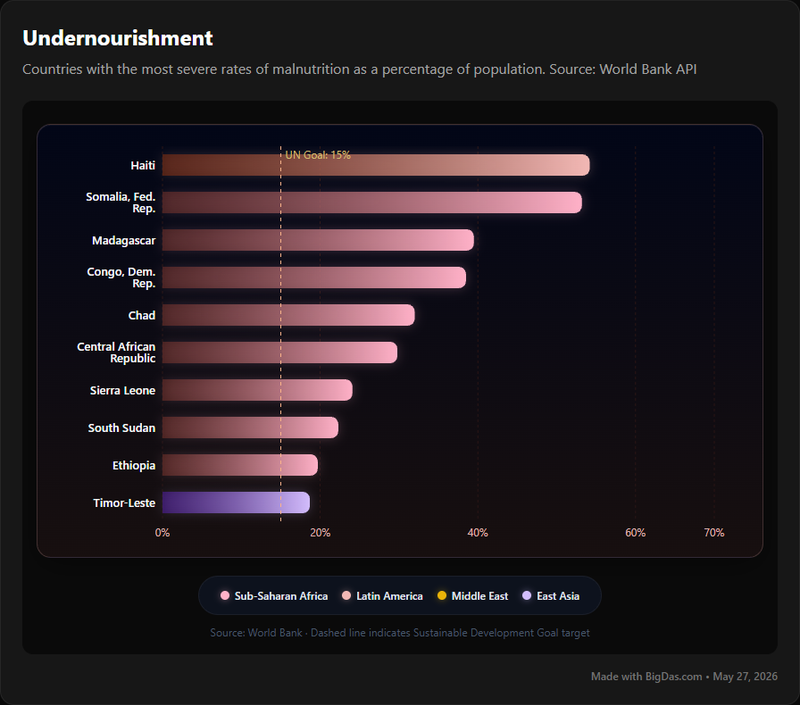
What "Hunger" and "Undernourishment" Mean
Hunger and undernourishment are related but distinct concepts.
Hunger is the physical sensation of not having eaten enough. Chronic hunger describes a persistent state of insufficient food intake that leads to long-term health consequences.
Undernourishment is a specific physiological condition defined by the Food and Agriculture Organization (FAO). A person is undernourished when their habitual food consumption falls below the dietary energy level required to maintain a normal, active, healthy life. The condition must last at least one year. National undernourishment statistics are calculated as the share of a population in this state.
Malnutrition is a broader category. It covers:
- Undernourishment: insufficient caloric intake.
- Micronutrient deficiencies: lack of vitamins and minerals such as iron, iodine, and vitamin A, sometimes called "hidden hunger."
- Overweight and obesity: excess energy intake leading to unhealthy weight gain.
Undernourishment is one form of malnutrition, but it is the most widespread in low-income countries and the one most strongly tied to poverty, conflict, and climate stress. It impairs physical and cognitive development, increases disease risk, and reinforces poverty across generations.
Food security exists when all people, at all times, have physical, social, and economic access to sufficient, safe, and nutritious food that meets their dietary needs and preferences for an active and healthy life.
The tool tracks undernourishment prevalence because it is a quantified, comparable indicator of where food insecurity is most acute.
Features and What They Do
The tool turns raw statistics into interactive visuals. Its main components:
1. Interactive Global Map
- Function: Plots each country by the percentage of the population classified as undernourished. Users can zoom, pan, and click individual countries.
- Use: Identifies global hotspots at a glance.
2. Country Profiles
- Function: Selecting a country opens a profile with historical undernourishment trends, demographic breakdowns where available, and links to socio-economic indicators such as GDP per capita, conflict indices, climate vulnerability, and agricultural output.
- Use: Provides context for the numbers and shows how poverty and conflict interact with malnutrition.
3. Time-Series Data and Trend Analysis
- Function: Charts undernourishment over decadal, five-year, or year-on-year intervals. Date ranges are user-selectable.
- Use: Tracks whether a country's situation is improving or worsening, and supports evaluation of food security policies.
4. Comparative Analytics
- Function: Compares undernourishment rates across multiple countries, regions, or income groups side-by-side, with benchmarking and basic statistics.
- Use: Supports regional strategy development and peer comparison.
5. Data Access and Methodology Documentation
- Function: Provides raw data files plus documentation of sources (FAO, WHO, World Bank, national statistics offices) and known limitations.
- Use: Allows researchers to verify figures and assess reliability.
6. Export and Reports
- Function: Downloads data in CSV or Excel format and exports maps and charts as high-resolution images. Some versions support custom PDF reports.
- Use: Produces visuals and data for policy briefs, academic papers, and advocacy material.
Summary of Benefits
- Decision-making: Concrete figures for targeting interventions and allocating resources.
- Clarity: Unbiased view of severity and geographic distribution.
- Advocacy: Visuals and statistics for public awareness campaigns.
- Research and education: A primary source for academic work and classroom projects.
- Accountability: Tracks progress against Sustainable Development Goal 2 (Zero Hunger).
How to Use the Tool
Step 1: Open the Platform
Go to the tool's URL. The landing page shows a color-coded world map of undernourishment prevalence, often with a dashboard of global statistics.
Step 2: Navigate the Map
- Zoom and pan with the mouse.
- Hover over a country to see its name and current prevalence.
- Use filters (year, region, severity threshold) where available.
Step 3: Open a Country Profile
Click any country to load its profile. The page typically includes:
- Current undernourishment prevalence.
- Historical trend graph with a date-range selector.
- Contextual data on poverty, conflict, climate, and national food security policies.
Step 4: Run Trend and Comparison Analyses
- Adjust the start and end years on the trend chart to isolate a specific period.
- Use the "Compare" or "Benchmark" feature to add multiple countries. Parallel charts and tables display side-by-side rates and trends.
Step 5: Check Methodology and Sources
Open the "About" or "Methodology" section, usually in the header or footer. Review the data sources (FAO, WHO, World Bank, national agencies) and read the notes on how undernourishment is calculated and where the data has limitations.
Step 6: Export Data and Visuals
- Click "Export" or "Download" to save raw data in CSV or Excel.
- Use "Export Image" or "Share" to save high-resolution graphics for presentations and reports.
- Where available, compile selected views into a custom PDF.
Who Uses It and Why
Policymakers and Government Agencies
- Develop national food security strategies backed by current prevalence data.
- Allocate budgets to the regions and populations with the highest need.
- Track progress against SDG 2 and other food security targets.
NGOs and Aid Organizations
- Identify priority areas for humanitarian aid and nutrition programs.
- Establish baselines and measure the impact of interventions.
- Use visuals and figures in donor proposals and awareness campaigns.
Researchers and Academics
- Use the country profiles and time-series data as a primary source.
- Analyze long-term trends and test hypotheses about the drivers of undernourishment.
- Cross-reference the data with climate, economic, and political datasets.
Journalists and Media
- Build reports, articles, and documentaries around interactive visuals and country-level data.
- Export high-resolution charts and maps for publication.
- Cite transparent methodology to support fact-checked reporting.
Educators and Students
- Use the tool as a teaching aid in courses on global development, public health, geography, and economics.
- Source data for student projects, debates, and presentations.
- Build awareness of global disparities through direct engagement with the figures.
Citizens and Activists
- Move beyond headlines to see which regions and communities are most affected.
- Support advocacy and letter-writing with specific data points.
- Identify charities working in areas of greatest need.
Frequently Asked Questions
Q1: How is "undernourishment" defined here?
A: Undernourishment means a person's habitual food consumption is insufficient to provide the dietary energy needed to maintain a normal, active, healthy life. It is a chronic condition, typically measured over at least one year, and is a key indicator of food insecurity and a specific form of malnutrition.
Q2: What data sources does the tool use?
A: The primary sources are the Food and Agriculture Organization (FAO), the World Health Organization (WHO), UNICEF, and the World Bank. Where available, validated national census and health survey data are also included.
Q3: How often is the data updated?
A: Most datasets are updated annually or biannually, in line with the release cycles of the source organizations. Specific schedules are listed in the Methodology section.
Q4: Can I compare data across years and countries?
A: Yes. The time-series view shows a single country over different years, and the Comparative Analytics feature displays multiple countries or regions side-by-side.
Q5: Is the tool free to use?
A: The core features (interactive maps, country profiles, basic comparisons) are free. Any premium data tiers or institutional licenses would be listed on a separate pricing or partnerships page.
Q6: How does the tool show the link between poverty and hunger?
A: Country profiles include socio-economic indicators such as GDP per capita and income inequality measures alongside undernourishment trends, making the correlation visible.
Q7: Can I download the data and visuals?
A: Yes. Raw data is available in CSV and Excel formats. Maps and charts can be exported as high-resolution images.
Q8: How can I act on what the data shows?
A: Share the findings, advocate for stronger food security policies, support reputable NGOs working in affected regions, and adopt sustainable food practices in your own context.
Summary
The Hunger & Undernourishment tool converts global statistics on undernourishment into an interactive map and country-level profiles. It covers current prevalence, historical trends, comparative analytics, methodology documentation, and exportable data and visuals. Policymakers, researchers, NGOs, journalists, educators, and the public can use it to identify where undernourishment is most severe, track changes over time, and ground discussions of food security and poverty in verifiable figures.