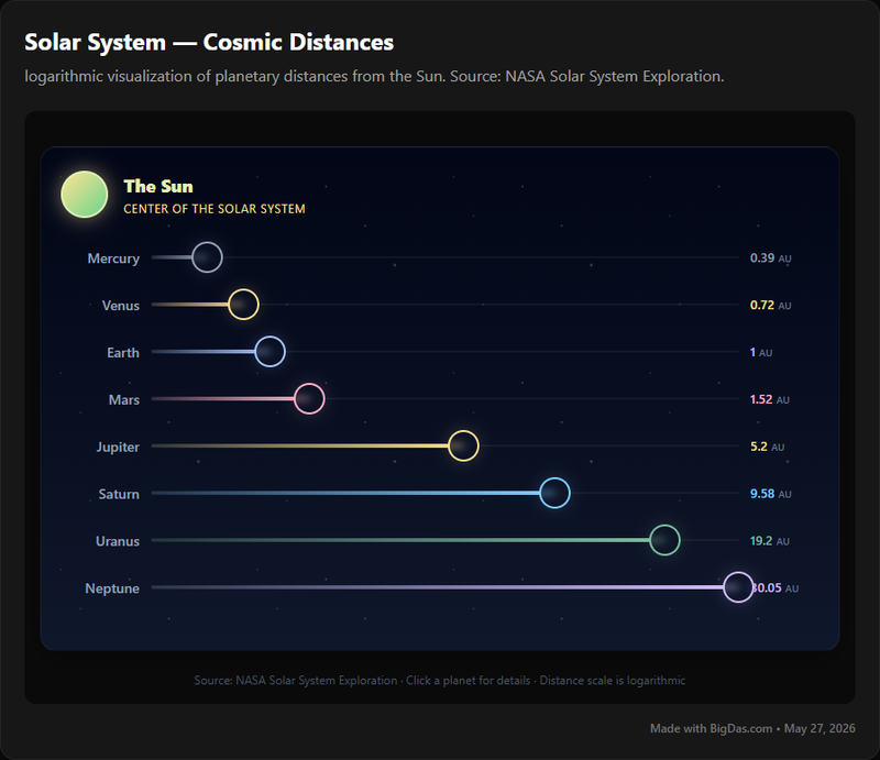
Solar System Distances

Unveiling the Cosmos: A Visual Journey Through Solar System Distances
The sheer immensity of space is perhaps one of the most profound concepts humanity grapples with. From the tiny particles that make up our world to the vast stretches between galaxies, the universe operates on scales that often defy our everyday comprehension. Nowhere is this more apparent than when we consider the distances within our own celestial neighborhood – the solar system. How far is Venus from the Sun compared to Jupiter? How do we truly visualize the astronomical units (AU) that separate Earth from the icy frontiers of Neptune?
For decades, we've relied on static diagrams, complex equations, and abstract numbers to try and grasp these cosmic dimensions. While informative, these traditional methods often leave a gap between factual knowledge and genuine intuitive understanding. What if there was a way to bridge this gap, to truly see and feel the staggering distances that define our planetary home?
Enter Solar System Distances – an innovative, interactive visualization tool designed to transform abstract astronomical data into an accessible, engaging, and profoundly insightful experience. This post will delve deep into what makes this tool a game-changer for anyone curious about space, planets, and the intricate dance of celestial mechanics. Whether you're a student, an educator, an astronomy enthusiast, or simply someone who appreciates when data is beautiful, prepare to embark on a journey that puts the scale of our solar system directly at your fingertips.

What is Solar System Distances?
Solar System Distances is not just another infographic; it's a dynamic, interactive digital platform engineered to provide a visual representation of the distances between the Sun and the major planets, as well as their relative positions. Its primary objective is to demystify the abstract numbers that often characterize discussions about space and translate them into a tangible, explorable environment.
At its core, the tool allows users to pan, zoom, and explore a scaled model of our solar system. Unlike static images where planetary orbits are often depicted unrealistically close for convenience, Solar System Distances endeavors to convey the true, breathtaking emptiness that lies between celestial bodies. It’s an educational powerhouse that leverages the power of visual learning to communicate complex scientific data with unparalleled clarity.
Imagine being able to dynamically adjust the scale, comparing the tightly packed inner planets (Mercury, Venus, Earth, Mars) with the vast gulfs separating the gas giants (Jupiter, Saturn, Uranus, Neptune). This tool does precisely that, offering a perspective that traditional textbooks or simple diagrams often struggle to achieve. By making the invisible visible, Solar System Distances fosters a deeper, more intuitive understanding of the structure and scale of our cosmic backyard. It’s an essential resource for anyone seeking to move beyond rote memorization of facts and truly internalize the majesty of the solar system.
Key Features & Benefits That Illuminate the Cosmos
The true power of Solar System Distances lies in its carefully crafted features, each designed to enhance understanding and engagement. This tool doesn't just present data; it makes it an experience.
1. Interactive & Dynamic Visualization
- Feature: Users can fluidly pan across the entire solar system, zoom in on individual planets, and even rotate the 3D model to view it from different perspectives.
- Benefit: This hands-on interaction transforms passive viewing into active exploration. It allows you to develop a spatial understanding of the solar system that static images simply cannot provide. You gain an intuitive grasp of the vastness of space by controlling your journey through it.
2. Precise Data Display & Unit Flexibility
- Feature: The tool provides accurate, real-time or average distances for each planet from the Sun, as well as between any two selected celestial bodies. Users can switch between various units of measurement, including Astronomical Units (AU), kilometers (km), and miles.
- Benefit: This feature is crucial for both accuracy and accessibility. Whether you're conducting academic research or just satisfying your curiosity, you get precise figures. The ability to switch units makes the data relatable to different contexts and educational levels, making complex astronomy accessible.
3. Dynamic Scaling for True Perspective
- Feature: A standout functionality is the option to switch between linear and logarithmic scales. A linear scale accurately depicts the immense empty spaces, while a logarithmic scale allows for easier comparison of the closer inner planets without rendering the outer planets impossibly far away on a typical screen.
- Benefit: This addresses one of the biggest challenges in visualizing the solar system: how to show both Mercury and Neptune on the same canvas without losing context. The dynamic scaling helps users truly appreciate the mind-boggling scale differences, powerfully illustrating just how much space there is between the outer giants. It’s a testament to how "data is beautiful" when presented thoughtfully.
4. Comprehensive Planet-Specific Information
- Feature: Clicking on any planet brings up a detailed information panel, often populated with data from authoritative sources like NASA. This includes facts about its size, composition, orbital period, moons, and other intriguing characteristics.
- Benefit: This transforms the visualization into an integrated learning hub. Instead of just seeing the distance, you immediately gain context about the object itself, enriching your understanding of its place in the solar system and its unique properties. It brings the data to life with rich scientific detail.
5. Comparative Analysis Capabilities
- Feature: The tool allows for direct comparison of distances, for instance, showing how many times farther Jupiter is from the Sun than Earth, or the distance between Earth and Mars at different points in their orbits.
- Benefit: Understanding relative scale is key to grasping astronomical concepts. This feature facilitates direct comparisons, helping to build a more nuanced mental model of the solar system's architecture and the relationships between its planets.
6. Time-Lapse Orbital Simulations
- Feature: Some advanced versions of the tool might offer a time-lapse feature, allowing users to accelerate time and watch the planets revolve around the Sun, demonstrating their orbital paths and varying speeds.
- Benefit: This isn't just visually stunning; it’s profoundly educational. Seeing orbits in motion helps to solidify concepts of orbital mechanics, gravity, and the cyclical nature of planetary movements, providing a dynamic understanding of astronomy.
7. User-Friendly & Intuitive Interface
- Feature: Despite its sophisticated functionality, the interface is designed to be clean, intuitive, and easy to navigate for users of all technical proficiencies.
- Benefit: Accessibility is paramount. A complex tool is only useful if it can be easily used. This ensures that educators, students, and casual enthusiasts alike can quickly dive into exploration without a steep learning curve, making the wonders of space accessible to everyone.
8. High-Fidelity Graphics & Aesthetic Appeal
- Feature: The visualization boasts high-resolution graphics, realistic planetary textures, and a smooth user experience.
- Benefit: This is where the "data is beautiful" aspect truly shines. A visually stunning presentation enhances engagement, makes learning more enjoyable, and inspires a greater sense of wonder about the solar system. The aesthetic quality makes the scientific data compelling and memorable.
Each of these features contributes to making Solar System Distances an indispensable resource for anyone eager to truly comprehend the cosmic ballet playing out right here in our own neighborhood.
Step-by-Step Guide: How to Navigate Solar System Distances
Embarking on your visual journey through our solar system is straightforward with the Solar System Distances tool. Here's a simple guide to get you started:
1. Accessing the Tool
- Step 1: Open your web browser or dedicated application and navigate to the Solar System Distances platform.
- Tip: Ensure you have a stable internet connection for the best experience, especially if the tool streams high-resolution data or complex simulations.
2. Initial Exploration and Navigation
- Step 2: Upon loading, you'll typically be presented with an overview of the solar system, centered on the Sun.
- Pan: Click and drag your mouse (or use touch gestures on a mobile device) to move the entire view across the screen. This allows you to follow planets as they orbit or simply explore different regions of space.
- Zoom: Use your mouse scroll wheel (or pinch-to-zoom on touchscreens) to zoom in and out. Zooming out will reveal the vast emptiness between the outer planets, while zooming in will bring the inner planets or even individual planets into closer focus.
- Rotate/Orbit: In some 3D implementations, you can right-click and drag (or use a two-finger swipe) to rotate the entire solar system model, viewing it from different angles above or below the ecliptic plane.
3. Selecting a Planet and Viewing Its Data
- Step 3: Hover your mouse cursor over a planet (or tap it on a touch device). A tooltip might appear, showing its name and perhaps its current distance from the Sun.
- Step 4: Click on the planet you wish to learn more about. This action will usually bring up a dedicated information panel on the side or bottom of your screen.
- Explore Data: This panel will display key statistics such as the planet's diameter, mass, orbital period, and most importantly, its distance from the Sun (in AU, km, or miles). Many panels will also include fascinating facts and images, often sourced from NASA missions.
4. Customizing Your View: Scale and Units
- Step 5 (Scale): Look for controls labeled "Scale" or "View Mode." Here, you can typically switch between a "Linear Scale" and a "Logarithmic Scale."
- Linear Scale: Provides the most accurate visual representation of the actual distances, making the inner planets appear very close and the outer planets incredibly far. This is excellent for truly appreciating the vastness of space.
- Logarithmic Scale: Compresses the extreme distances, making it easier to see and compare all planets on a single screen without them disappearing into tiny dots. This is great for an overview.
- Step 6 (Units): Locate the "Units" selector (often a dropdown menu or toggle buttons). Choose your preferred unit of measurement: Astronomical Units (AU), kilometers (km), or miles. This allows you to interpret the distances in a context that is most familiar or useful to you.
5. Comparing Distances Between Objects
- Step 7: Many tools allow you to select two objects for direct comparison. Click on the first planet, then look for an option like "Compare" or "Measure Distance To." Then, click on the second planet.
- Analyze Comparison: The information panel will then update to show the current distance between these two specific planets, providing invaluable insights into their relative positions.
6. Engaging with Time-Lapse (If Available)
- Step 8: If the tool features an orbital simulation, find the "Play/Pause," "Speed," or "Time" controls.
- Observe Orbits: Start the simulation to watch the planets move along their orbital paths. Adjust the speed to observe how different planets orbit at varying rates, a direct consequence of their distance from the Sun and its gravitational pull. This truly brings the mechanics of the solar system to life.
By following these steps, you'll quickly become proficient in using Solar System Distances to explore the wonders of our solar system with unprecedented clarity and insight.
Why You Need This Tool: Unlocking New Perspectives
The Solar System Distances visualization tool isn't just a neat gadget; it's a powerful educational and exploratory resource that addresses a fundamental challenge in understanding space. Here’s why it’s an indispensable asset for a diverse range of users:
For Educators and Students: Bridging the Abstract with the Tangible
- Challenge: Teaching and learning about astronomical distances often involves rote memorization of huge, abstract numbers (e.g., 1 AU = 150 million km). This rarely leads to genuine comprehension of scale.
- Solution: Solar System Distances provides a dynamic, visual platform where students can experience these distances. They can zoom out to appreciate the vast emptiness between the gas giants or zoom in to compare the relative closeness of the inner planets. This interactive approach significantly enhances retention and understanding, making astronomy concepts concrete and engaging. It makes the solar system truly accessible.
For Space Enthusiasts and Budding Astronomers: Deepening Personal Exploration
- Challenge: Even seasoned enthusiasts can struggle to keep all the facts straight or truly visualize the cosmic architecture described in books and documentaries.
- Solution: This tool offers an unprecedented level of interactive exploration. You can effortlessly compare the distance of Jupiter from the Sun versus that of Earth, understand the orbital dynamics through simulations, and delve into NASA-backed facts about each planet. It’s a personalized observatory and a constant source of wonder, allowing you to explore at your own pace and depth.
For Data Visualization Practitioners and Designers: A Masterclass in "Data is Beautiful"
- Challenge: Effectively presenting complex, multi-scale data in a visually compelling and comprehensible manner is a significant design challenge.
- Solution: Solar System Distances serves as an exemplary case study in effective data visualization. Its intuitive interface, dynamic scaling options, and clear presentation of immense scales demonstrate best practices in making "data is beautiful" a reality. Designers can study its approach to communicate scale, information hierarchy, and user interaction for their own projects, learning how to transform daunting datasets into engaging narratives.
For Parents and Children: Igniting Curiosity and Shared Learning
- Challenge: Introducing young minds to the wonders of space often requires captivating, interactive experiences that go beyond static pictures.
- Solution: The vibrant graphics and hands-on nature of the tool make it perfect for family learning. Parents can guide children through the solar system, pointing out planets, discussing their characteristics, and watching their orbits. It’s an engaging way to spark a lifelong interest in astronomy and science, transforming learning into a fun, shared adventure.
For Researchers and Science Communicators: A Quick, Reliable Reference
- Challenge: Quickly retrieving accurate relative distance information or a visual aid for presentations can be time-consuming, involving cross-referencing multiple sources.
- Solution: With its precise data and customizable views, the tool acts as a rapid-access reference for current or average planetary distances. It can also generate powerful visual aids for reports, lectures, or public outreach initiatives, ensuring accurate and impactful communication about our solar system.
For Anyone with an Inquisitive Mind: Satisfying the Innate Quest for Knowledge
- Challenge: We are naturally curious about our place in the universe, but the vastness of space can feel overwhelming and abstract.
- Solution: Solar System Distances transforms the abstract into the accessible. It allows anyone, regardless of their scientific background, to directly engage with the scale and grandeur of our cosmic neighborhood. It answers fundamental questions like "How far is that really?" in a way that resonates deeply, fostering a greater appreciation for the universe and the tiny blue marble we call home.
In essence, whether your goal is to teach, learn, inspire, or simply explore, Solar System Distances provides the clarity and engagement needed to truly grasp the awe-inspiring dimensions of our solar system.
Frequently Asked Questions (FAQ)
To further assist you in understanding and utilizing Solar System Distances, here are answers to some common questions:
Q1: Is the Solar System Distances tool free to use?
A1: Most basic versions of interactive solar system distance visualizations are freely accessible online, often supported by educational institutions, non-profits, or government agencies like NASA. Some advanced versions with additional features (e.g., historical data, more celestial bodies, offline access) might be part of paid applications or subscriptions. Always check the specific platform for details.
Q2: What data sources does Solar System Distances use for its information?
A2: Reputable Solar System Distances tools typically draw their data from highly authoritative and peer-reviewed scientific sources. The most common and reliable data comes from space agencies like NASA (National Aeronautics and Space Administration), ESA (European Space Agency), and organizations like the IAU (International Astronomical Union). This ensures the accuracy and scientific integrity of the presented distances and planetary facts.
Q3: Can I use this tool for educational purposes in a classroom setting?
A3: Absolutely! Solar System Distances is an exceptional educational resource. Its interactive nature, dynamic scaling, and clear visualization make complex astronomy concepts much more understandable and engaging for students of all ages. Many educators find it invaluable for demonstrating scale, orbital mechanics, and relative planetary positions. Check for any specific licensing agreements if you plan to integrate it into published curriculum materials, but for classroom display and interaction, it's generally encouraged.
Q4: Does the tool only show the eight major planets, or does it include dwarf planets and other celestial bodies?
A4: The coverage varies by specific implementation. Most versions will prominently feature the eight major planets. More comprehensive tools might also include dwarf planets (like Pluto, Eris, Ceres, Makemake, Haumea), major moons (e.g., Earth's Moon, Jupiter's Galilean moons), asteroids, and comets. Check the tool's options or documentation to see its full scope of included celestial objects.
Q5: How accurate are the distance measurements provided by the tool? Is it real-time data?
A5: The distance measurements are highly accurate, typically based on current scientific models and NASA ephemeris data. Whether it's "real-time" depends on the tool. Many tools show average orbital distances or provide snapshots for a given date. More advanced simulations might dynamically calculate and display distances that change with the planets' orbits. The tool usually specifies if it's showing current, average, or simulated dynamic distances.
Q6: What units of measurement are available for displaying distances?
A6: Most interactive Solar System Distances tools offer multiple units to cater to different user preferences and educational needs. The most common units include:
- Astronomical Units (AU): Where 1 AU is the average distance from the Earth to the Sun. This unit is particularly useful for comparing distances within the solar system.
- Kilometers (km): The standard metric unit for large distances.
- Miles (mi): Another common unit, especially in countries using the imperial system. Many tools allow you to switch between these units with a simple click.
Q7: Is the Solar System Distances tool mobile-friendly or available as an app?
A7: Many modern web-based versions of Solar System Distances are designed with responsive layouts, making them accessible and usable on mobile devices and tablets. Additionally, some developers offer dedicated mobile applications for iOS and Android that provide an optimized touch-screen experience. Check your device's app store or the tool's official website for mobile compatibility and app availability.
Q8: How does the "dynamic scaling" feature work, and why is it important?
A8: The dynamic scaling feature (often switching between linear and logarithmic scales) is crucial for visualizing the immense scale differences within the solar system.
- Linear Scale: Represents distances proportionally. This accurately shows that the inner planets are very close to the Sun and to each other, while the outer planets are incredibly far apart, often appearing as tiny dots at the edge of the screen. It highlights the vast emptiness of space.
- Logarithmic Scale: Compresses larger distances more than smaller ones. This allows all major planets to be viewed simultaneously on a single screen, making it easier to compare their relative positions and distances without losing the outer planets entirely. This feature is vital for helping users truly grasp the mind-boggling scale of our solar system in both a granular and holistic way, epitomizing how "data is beautiful" when rendered with purpose.
Conclusion: Bridging the Gap Between Numbers and Understanding
The Solar System Distances visualization tool stands as a testament to the power of well-designed interactive data. It skillfully bridges the often-daunting gap between abstract astronomical numbers and a genuinely intuitive understanding of the vast scale that defines our cosmic home. No longer do we need to struggle with static diagrams or mind-numbing figures to comprehend the incredible distances that separate the Sun from its orbiting planets.
By offering dynamic exploration, precise data from sources like NASA, and a choice of scaling options, this tool transforms passive learning into an active, engaging journey. It makes the "data is beautiful" principle a reality, presenting complex scientific information with an aesthetic elegance that inspires awe and fosters deeper comprehension. Whether you are an astronomy enthusiast, a student, an educator, or simply someone captivated by the wonders of space, Solar System Distances is an invaluable resource. It empowers you to not just know about the solar system, but to truly experience its breathtaking grandeur and appreciate the intricate dance of celestial mechanics playing out on a scale that is both humbling and profoundly inspiring. This tool is a window into the universe, inviting you to explore the vastness with clarity and wonder.