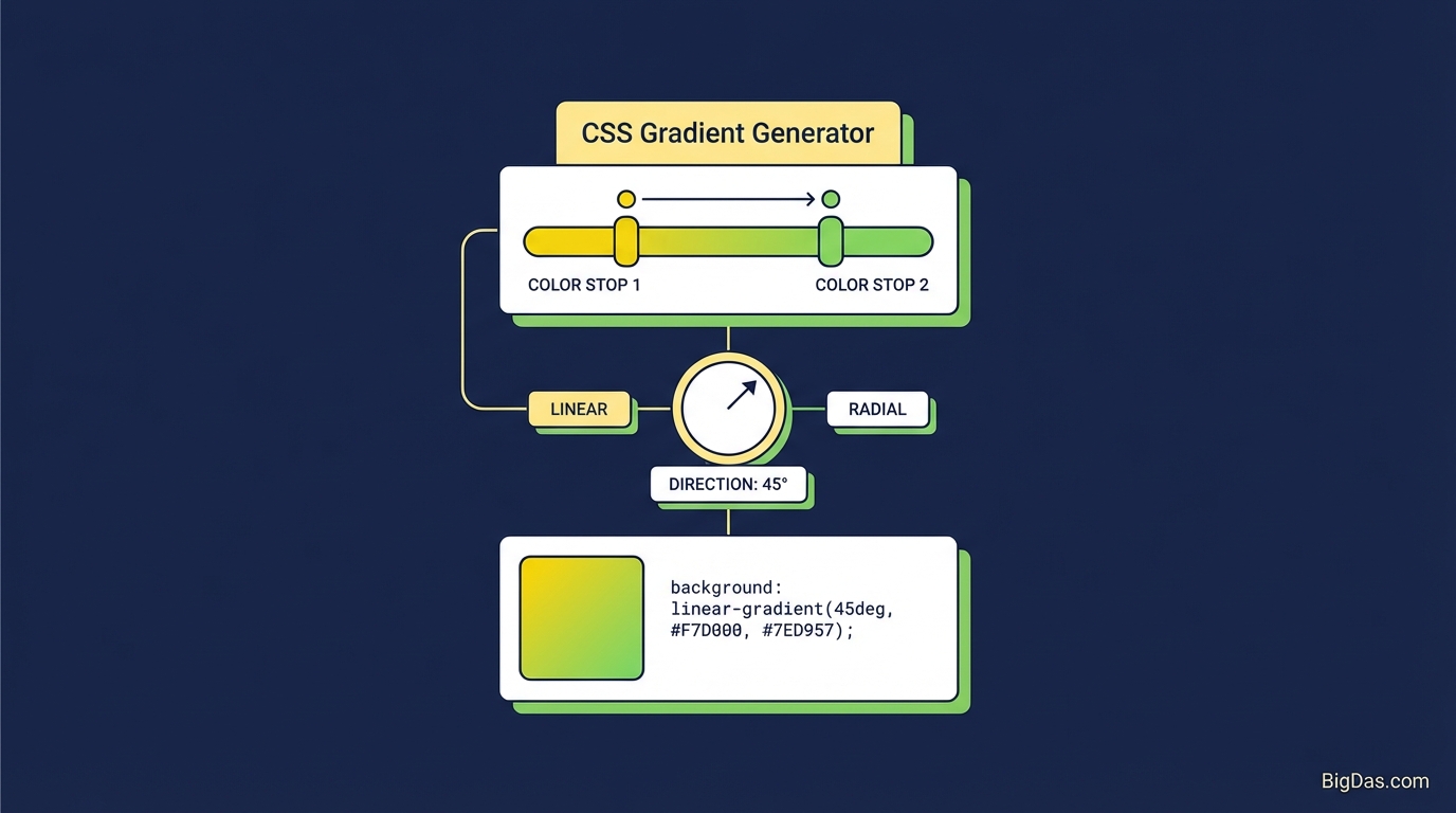
CSS Gradient Generator
 Modern scientific illustration of CSS Gradient Generator
Master Web Aesthetics: The CSS Gradient Generator for Designers & Developers
Flat backgrounds have lost their appeal. Modern web design relies on depth, texture, and color transitions to create engaging interfaces. The technique behind immersive hero sections and standout call-to-action buttons is CSS Gradients.
Manually coding these gradients, however, is tedious. You wrestle with syntax errors, misplaced commas, and RGBA calculations. A visual generator removes that friction by letting you design the gradient and output valid, cross-browser CSS automatically.
The Problem with Manual CSS Coding
A basic linear gradient looks simple:
background: linear-gradient(90deg, red, blue);
But real-world design is rarely that simple. You need precise angles, multiple color stops, varying opacity for glass effects, and fallback rules for older browsers. The code quickly grows into something like this:
background: -webkit-linear-gradient(45deg, rgba(255,0,150,1) 0%, rgba(0,204,255,1) 100%);
background: -o-linear-gradient(45deg, rgba(255,0,150,1) 0%, rgba(0,204,255,1) 100%);
background: linear-gradient(45deg, rgba(255,0,150,1) 0%, rgba(0,204,255,1) 100%);
Writing this by hand is slow and error-prone. A dedicated generator handles it for you.
What Is the CSS Gradient Generator?
The CSS Gradient Generator is a visual editor that lets you construct gradients and instantly copy the corresponding CSS.
It works like the gradient tools in Photoshop or Figma but outputs clean web code. Instead of typing syntax, you drag color stops and adjust sliders. The tool manages the background-image property for you.
Supported Gradient Types
- Linear Gradients: Colors transition along a straight line, vertical, horizontal, or diagonal.
- Radial Gradients: Colors radiate outward from a central point, creating circular or elliptical patterns.
- Color Formats: Hexadecimal (
#FFFFFF), RGB (255, 255, 255), and RGBA (with alpha transparency).
Key Features
1. Real-Time Preview
The preview updates as you adjust sliders or pick colors. You can test combinations without writing or refreshing any code.
2. Multiple Color Stops
You are not limited to two colors. Add unlimited stops to build sunset effects, metallic finishes, or multi-tone blends. Each stop has its own position percentage.
3. Alpha Transparency
RGBA support lets you fade colors to transparent. This is useful for:
- Overlays on hero images to improve text readability.
- Glassmorphism and frosted-glass effects.
- Subtle depth and shadow.
4. 360-Degree Angle Control
The angle wheel lets you set the exact gradient direction, from standard 180deg (top to bottom) to a diagonal 135deg.
5. Clean CSS Output
The tool outputs minified, standards-compliant CSS. No bloat, no unnecessary properties.
How to Design a Gradient
Step 1: Choose the Gradient Type
- Linear: Best for buttons, headers, and section backgrounds.
- Radial: Best for focal points and vignette effects.
Step 2: Pick Your Colors
Click a color stop to open the color picker. Enter hex codes directly if you are following a brand guide, or experiment freely.
Tip: To avoid a muddy gray midpoint, use analogous colors (next to each other on the color wheel) or insert a bridging middle color stop.
Step 3: Adjust Stop Positions
Drag the stops along the slider to control where each color transition occurs.
- Stops far apart: smooth, soft blend.
- Stops close together: sharp transition, almost a hard line.
Step 4: Set the Direction
Use the angle wheel. Top-left lighting (135deg to 180deg) tends to look natural, while horizontal gradients (90deg) fit tech and SaaS aesthetics.
Step 5: Copy and Paste
Click the Copy CSS button and paste the code into your stylesheet:
.hero-section {
 background: linear-gradient(90deg, rgba(2,0,36,1) 0%, rgba(9,9,121,1) 35%, rgba(0,212,255,1) 100%);
}
Practical Use Cases
1. Improving Text Readability
White text over a photograph is hard to read. A transparent-to-black linear gradient overlaid on the bottom of the image fixes the contrast without darkening the whole photo.
2. Replacing Heavy Images
Background patterns used to require PNG or JPG files, which hurt load times. CSS gradients are a few kilobytes and render instantly, which improves Core Web Vitals and SEO.
3. Hover and Interactive States
A slightly shifted gradient on :hover gives buttons a tactile, responsive feel. Generate the base and hover variants in seconds.
4. Brand Consistency
Enter your brand's exact hex codes and generate a smooth transition between them. The result feels polished without looking flat.
Advanced Techniques
- Hard Stops: Place two color stops at the same percentage (e.g. Color A at 50% and Color B at 50%) to create sharp geometric divisions without using borders.
- Stacked Gradients: CSS supports multiple background images. Combine a semi-transparent radial gradient with a linear gradient to simulate 3D lighting:
background: radial-gradient(circle, rgba(0,0,0,0.3), transparent), linear-gradient(135deg, #ff0099, #493240);
- Contrast Checks: If text sits on top of the gradient, verify that the colors meet WCAG contrast guidelines for accessibility.
Frequently Asked Questions (FAQ)
1. Will CSS gradients slow down my website?
No. Gradients are rendered by the browser engine. They require no HTTP requests and are far smaller than image files, making them the preferred choice for performant backgrounds.
2. What is the difference between Linear and Radial gradients?
A Linear Gradient moves along a straight line based on a defined angle. A Radial Gradient radiates outward from a central origin in a circle or ellipse. Use linear for UI elements and radial for spotlight effects.
3. Can I use this code in mobile apps like React Native or Flutter?
The hex codes and angles translate, but you cannot paste raw CSS into React Native. Convert the values to the framework's styling syntax. For web apps, PWAs, React.js, or Vue, the CSS works as-is.
4. Does this tool support older browsers?
All evergreen browsers (Chrome, Firefox, Safari, Edge) support CSS3 gradients natively. For Internet Explorer 9 or earlier, the browser will fall back to the first declared color or require vendor prefixes, rarely a concern in modern development.
Summary
Manual gradient coding wastes time. The CSS Gradient Generator lets you design visually and copy production-ready CSS in seconds.
Use it for landing pages, dashboards, portfolios, or any interface that needs depth and polish. Open the tool above, build your first gradient, and paste the result into your project.