Ant Colony Optimization
 Modern scientific illustration of Ant Colony Optimization
Visualize Ant Colony Optimization: The Ultimate Tool for Solving Complex Pathfinding Problems
In the world of computer science and operations research, nature is often the greatest architect. From the way neurons fire in the brain to the way birds flock in the sky, biological systems have evolved over millions of years to solve problems efficiently. Among these natural phenomena, few are as fascinating—or as mathematically powerful—as the foraging behavior of ants.
Complex network problems, such as the Traveling Salesman Problem (TSP) or dynamic network routing, are notoriously difficult to solve using brute force. As the number of nodes increases, the computational power required to find the perfect route grows exponentially.
Enter Ant Colony Optimization (ACO).
While the math behind ACO is robust, understanding how agents interact with the environment to converge on an optimal solution can be abstract and difficult to grasp. That is why we built the Ant Colony Optimization Visualizer.
This guide explores the depths of the ACO algorithm, explains why visualization is critical for mastery, and provides a step-by-step tutorial on using our best-in-class tool to solve complex optimization challenges.
What is Ant Colony Optimization (ACO)?
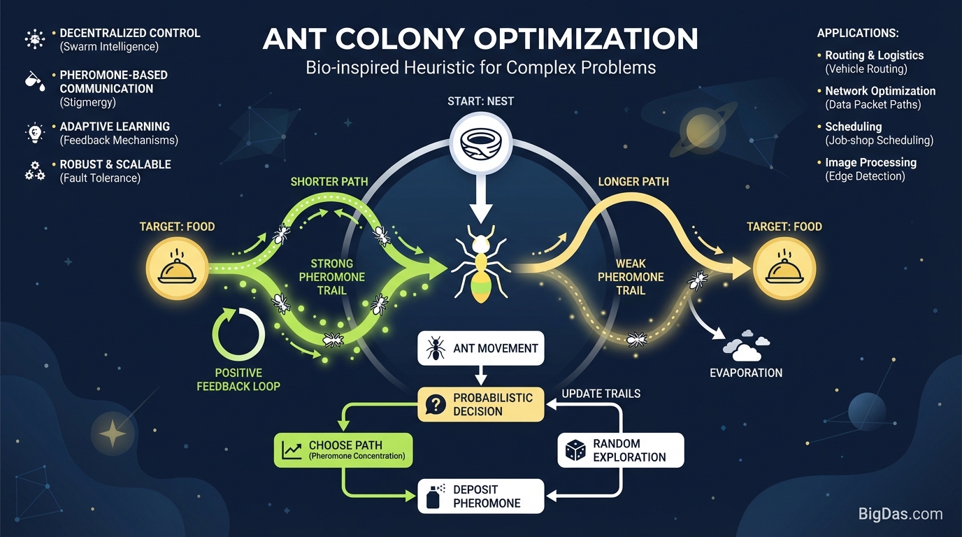
Ant Colony Optimization (ACO) is a probabilistic technique for solving computational problems which can be reduced to finding good paths through graphs. It falls under the umbrella of Swarm Intelligence—systems where simple agents following simple rules exhibit complex, intelligent global behavior.
The Biological Inspiration
To understand the algorithm, you must first look at the biology. Real ants are blind. When an ant forages for food, it wanders randomly. However, upon finding a food source, it returns to the colony while laying down a chemical trail known as a pheromone.
If other ants encounter this path, they are likely to stop wandering randomly and follow the trail instead. If the trail leads to food, they reinforce it with their own pheromones upon return.
- Short paths get traversed faster: An ant on a shorter path returns to the colony sooner, allowing it (and recruited ants) to lay down more pheromones per unit of time.
- Evaporation: Pheromones evaporate over time. On longer paths, the scent dissipates before it can be reinforced sufficiently. On shorter paths, the reinforcement outpaces evaporation.
Over time, the entire colony converges on the single most efficient path.
The Algorithmic Translation
In computer science, we simulate this behavior using "artificial ants" (agents) moving through a graph of nodes and edges.
- The Environment: A graph where nodes represent cities (or servers, or destinations) and edges represent the distance between them.
- The Agents: Virtual ants that traverse the graph, making probabilistic decisions at each node based on two factors: Pheromone strength (past experience) and Heuristic information (distance/cost).
- The Feedback Loop: The algorithm updates the edges of the graph based on the quality of the solutions constructed by the ants, gradually "evaporating" bad paths and "reinforcing" optimal ones.
Key Features & Benefits of Our ACO Visualization Tool
Optimization algorithms often function as "black boxes." You input data, and you get an output, but the internal convergence process remains a mystery. Our Ant Colony Optimization Tool shatters that black box, offering a real-time window into the algorithmic logic.
Here is why this tool is the industry standard for visualizing Swarm Intelligence:
1. Real-Time Convergence Visualization
Watch the chaos turn into order. Our tool renders the "pheromones" visually. You will see thick, bright lines emerge on the optimal paths while inefficient edges fade away (evaporate) in real-time. This provides immediate visual feedback on how quickly your parameters are forcing convergence.
2. Full Parameter Customization
ACO is sensitive to its hyperparameters. Our tool allows you to tweak:
- Alpha (α): The importance of the pheromone trail.
- Beta (β): The importance of the heuristic information (distance).
- Evaporation Rate (ρ): How quickly pheromone trails disappear.
- Ant Count: The number of agents in the swarm.
3. Dynamic Graph Generation
You are not limited to static presets. You can generate random node clusters, arrange them in circles, or manually place nodes to simulate specific geographic or network topologies.
4. Performance Metrics Dashboard
Visuals are great, but data is king. The tool displays a live dashboard showing:
- Global Best Distance found so far.
- Current Iteration count.
- Convergence speed graphs.
5. Step-by-Step Debugging
Pause the simulation at any iteration. Inspect the specific probability distribution an ant faces at a specific node. This is invaluable for debugging why an algorithm might be getting stuck in a local optimum rather than finding the global optimum.
Step-by-Step Guide: How to Use the Tool
Ready to optimize? Follow this guide to get the most out of the visualization tool.
Step 1: Define Your Environment
Launch the tool. You will see a blank canvas.
- Manual Mode: Click anywhere on the canvas to place a "City" (Node). Create a complex shape to challenge the ants.
- Random Generation: Use the sidebar to generate 20, 50, or 100 random nodes.
- Pro Tip: Start with 20 nodes to easily visualize the individual behavior of the ants before scaling up.
Step 2: Tune Your Hyperparameters
This is where the science happens. Before hitting "Start," adjust your sliders:
- Set Alpha (α) to 1.0: This is the standard weight for pheromones.
- Set Beta (β) to 2.0: We usually want distance to have a slightly higher weight than pheromones initially to prevent early convergence on a bad path.
- Set Evaporation (ρ) to 0.5: This creates a balance between remembering good paths and exploring new ones.
Step 3: Unleash the Colony
Click "Run Simulation."
- Watch the Pheromones: You will initially see a web of faint lines connecting all nodes. This represents the exploration phase.
- Observe the Shift: Within a few dozen iterations, specific lines will thicken and turn green (or your configured high-intensity color). These are the paths being reinforced.
- The Convergence: Eventually, a single, looping line connecting all nodes will emerge. This is the algorithm's solution to the Traveling Salesman Problem.
Step 4: Experiment and Iterate
Did the ants get stuck in a sub-optimal loop?
- Reset the simulation.
- Decrease the Evaporation Rate: This allows trails to last longer, encouraging exploration of alternative paths.
- Increase Randomness: Adjust the Q constant to introduce more noise into the system.
Why You Need This Tool (Use Cases)
While the Traveling Salesman Problem is the classic example, the underlying logic of our ACO Visualizer applies to vast real-world industries.
1. Logistics and Supply Chain
Delivery companies like UPS and FedEx utilize variations of pathfinding algorithms to route thousands of trucks daily. Visualizing these routes helps engineers understand bottlenecks and inefficiencies in the logic before deploying it to the fleet.
2. Telecommunications Routing
Data packets need to move from server A to server B through a cluttered network. ACO is used to find routes that balance speed with low congestion. Network engineers use this tool to simulate load balancing and dynamic routing protocols.
3. Game Development
AI agents in video games need to navigate terrain. Swarm intelligence is used to control groups of enemies or NPCs moving through a map. This tool helps developers visualize how agents will react to obstacles.
4. Academic Research & Education
For students and professors, abstract formulas are often barriers to learning. This tool is the bridge between the formula $$P_{ij}$$ and the actual movement of an agent, making it an essential educational aid for Computer Science curriculums.
Frequently Asked Questions (FAQ)
1. How is ACO different from Dijkstra’s Algorithm or A*?
Dijkstra and A* are exact algorithms designed for static graphs with a clear start and end point. They guarantee the shortest path but are computationally heavy on massive graphs. ACO is a probabilistic heuristic; it is designed for dynamic problems (like TSP) where you need a "very good" solution quickly, even if it isn't mathematically perfect every single time.
2. Why do my ants get stuck in a "local optimum"?
This happens when the pheromone intensity on a "decent" path becomes so strong that ants stop exploring other options. To fix this using our tool, increase the Evaporation Rate or decrease Alpha. This forces the colony to "forget" the bad path and explore more.
3. Can this tool handle 3D graphs?
Currently, this tool visualizes 2D planar graphs to ensure clarity in understanding the algorithm's behavior. However, the logic derived here is directly applicable to multidimensional optimization problems.
4. What is the "Pheromone Evaporation" rate?
It simulates the natural decay of scent trails. In the algorithm, it prevents unbounded accumulation of pheromone values and helps the system avoid getting trapped in local optima. If evaporation is 0, old paths never disappear, confusing the ants. If it is 1, ants have no memory, and the search becomes random.
Conclusion
Ant Colony Optimization is more than just a biological curiosity; it is a fundamental pillar of modern artificial intelligence and operational efficiency. However, implementing ACO without understanding the interplay of its parameters is a recipe for inefficiency.
Our Ant Colony Optimization Visualization Tool is the premier platform for demystifying Swarm Intelligence. Whether you are a student trying to pass an algorithms exam, a researcher fine-tuning a paper, or a logistics engineer optimizing a fleet, this tool provides the visual clarity you need to succeed.
Don't just calculate the path—see it.
[Start Your Simulation Now – Launch the ACO Visualizer]
(Internal Note: Ensure the link above directs to the main tool interface. Monitor user dwell time on the visualization page to gauge engagement for future iterations.)