MPSK Constellation Simulation
 Modern scientific illustration of MPSK Constellation Simulation
Master Digital Modulation: The Ultimate MPSK Constellation Simulation Tool
In the world of digital communications and telecommunications engineering, visualizing signal behavior is the bridge between abstract mathematics and real-world application. We often read about phase shifts, symbol rates, and noise floors, but rarely do we get to see them interact in real-time.
Whether you are a telecommunications engineering student struggling to grasp the I/Q plane, or a seasoned RF engineer needing a quick sandbox environment to demonstrate signal integrity, static textbook diagrams simply aren’t enough. You need dynamic visualization.
Enter the MPSK Constellation Simulation.
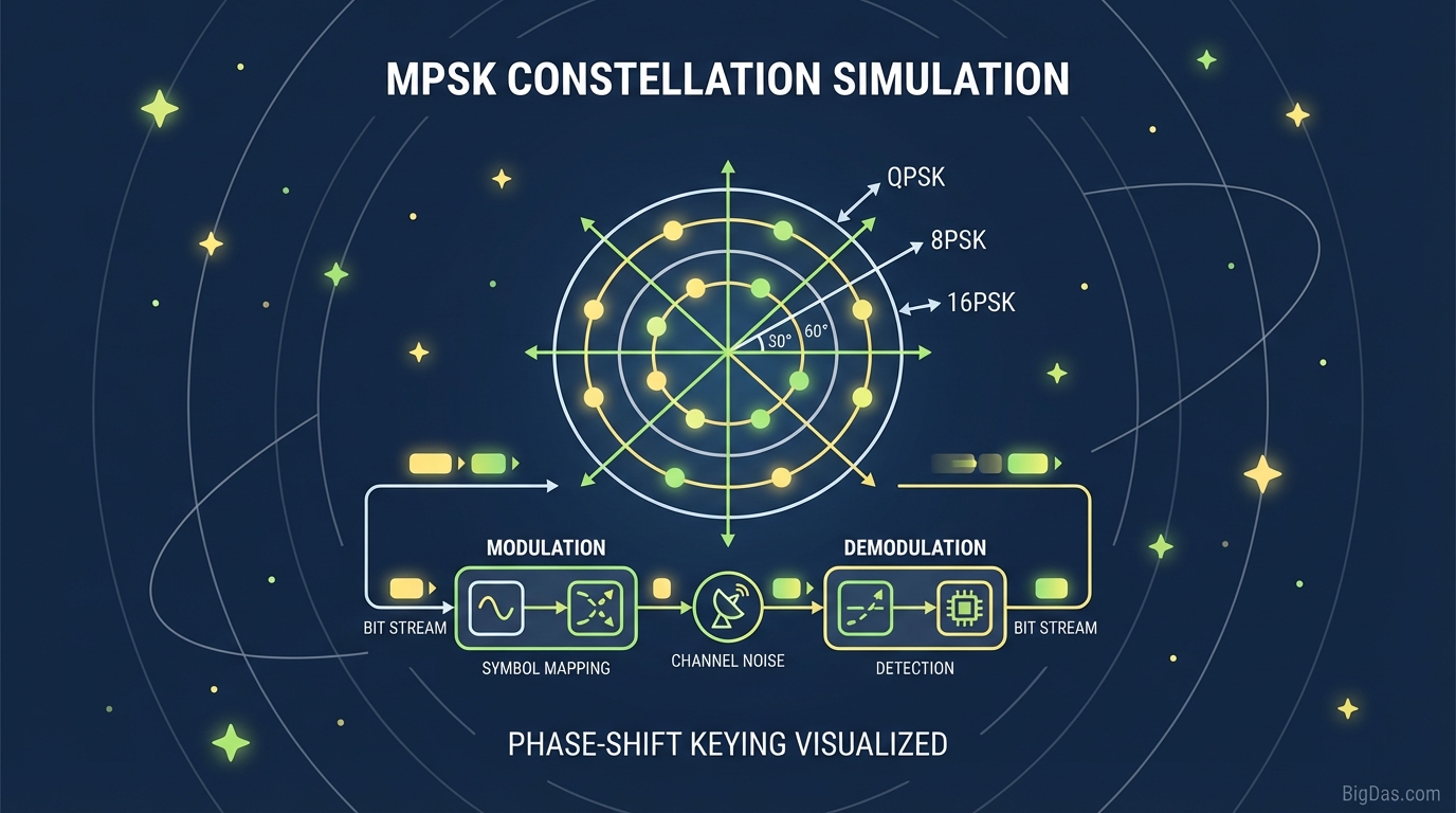
This tool is the best-in-class solution for visualizing the complex relationship between modulation schemes (BPSK, QPSK, 8PSK, 16PSK) and environmental interference. In this guide, we will dive deep into how this tool works, the theory behind MPSK, and how you can use this simulation to master the fundamentals of digital signal processing.
What is MPSK Constellation Simulation?
To understand the tool, we must first unpack the underlying technology. MPSK stands for M-ary Phase Shift Keying. It is a digital modulation scheme that conveys data by changing (modulating) the phase of a constant frequency reference signal (the carrier wave).
The MPSK Constellation Simulation is a browser-based visualization engine that renders the Constellation Diagram for various Phase Shift Keying schemes.
The Constellation Diagram: Your Map to the Signal
A constellation diagram is a representation of a signal modulated by a digital modulation scheme such as QAM or PSK. It displays the signal as a two-dimensional scatter diagram in the complex plane:
- The Horizontal Axis: Represents the In-Phase (I) component.
- The Vertical Axis: Represents the Quadrature (Q) component.
Each point on this diagram represents a symbol. The distance of the point from the center represents the amplitude (which is constant in PSK), and the angle of the point represents the phase.
Our tool takes this concept and animates it. It generates random data, modulates it according to the scheme you select (BPSK, QPSK, etc.), adds user-defined noise (simulating real-world interference), and plots the result instantly.
Deep Dive: Supported Modulation Schemes
This simulation tool allows you to toggle between the four most critical PSK modulation types used in modern satellite, Wi-Fi, and cellular communication.
1. BPSK (Binary Phase Shift Keying)
- The Basics: The simplest form of PSK. It uses two phases which are separated by 180° and can also be termed 2-PSK.
- In the Simulation: You will see two distinct clusters of dots on the left and right of the graph.
- Why it matters: It is the most robust of all PSK modulations. It takes the highest level of noise or distortion to make the demodulator reach an incorrect decision.
2. QPSK (Quadrature Phase Shift Keying)
- The Basics: QPSK uses four points on the constellation diagram, equispaced around a circle. With four phases, QPSK can encode two bits per symbol.
- In the Simulation: You will see four clusters (one in each quadrant).
- Why it matters: QPSK doubles the data rate of BPSK while maintaining the same bandwidth, making it the industry standard for many modern wireless applications.
3. 8PSK (8-Phase Shift Keying)
- The Basics: This scheme uses eight phases. Each symbol represents 3 bits of data.
- In the Simulation: The points begin to crowd. You will see 8 clusters arranged in a circle.
- The Trade-off: While you are transmitting more data, the "distance" between symbols is shorter, making error correction more difficult in noisy environments.
4. 16PSK (16-Phase Shift Keying)
- The Basics: The most dense scheme in this tool, using 16 phases to encode 4 bits per symbol.
- In the Simulation: The clusters are very close together.
- The Challenge: This requires an extremely high Signal-to-Noise Ratio (SNR) to work effectively. In the simulation, you will notice that even a small amount of noise causes the clusters to bleed into each other, simulating bit errors.
Key Features & Benefits of This Tool
Why is this specific MPSK Constellation Simulation considered the best in its class? It comes down to precision, interactivity, and educational value.
1. Real-Time Noise Adjustment (AWGN Simulation)
Static diagrams assume a perfect world. This tool introduces Additive White Gaussian Noise (AWGN). By adjusting the "Noise Level" or SNR slider, you can visually see the constellation points scatter. This feature allows you to visualize the Bit Error Rate (BER) threshold—the exact moment where noise becomes too great for the receiver to distinguish one symbol from another.
2. High-Resolution Rendering
Unlike other tools that lag or offer low-resolution plots, this simulation renders thousands of symbol samples per second. This creates a dense "cloud" effect that accurately represents how a spectrum analyzer views a signal over time.
3. Immediate Comparison Capability
Switching between QPSK and 16PSK takes milliseconds. This allows for immediate A/B testing. You can set the noise to a medium level and switch modulation types to see how a stable QPSK signal instantly becomes an unusable 16PSK signal under the same conditions.
4. Zero-Setup Environment
There is no need to install MATLAB, Python libraries, or GNU Radio. This tool runs entirely in the browser, making it accessible for classroom demos, quick engineering sanity checks, or studying on the go.
Step-by-Step Guide: How to Use the MPSK Simulation
To get the most value out of this simulation, follow this workflow:
Step 1: Select Your Modulation Scheme
Start with BPSK. Locate the modulation selector dropdown or buttons and choose "BPSK." Observe the two clean points on the graph. This is your baseline.
Step 2: Establish the "Clean" State
Locate the Noise/SNR Slider. Slide it to the position of minimum noise (highest SNR). The dots on the graph should appear tight, sharp, and distinct. This represents a perfect channel, like a cable connection with zero interference.
Step 3: Introduce Interference
Slowly increase the noise level. Watch the tight dots expand into fuzzy clouds.
- Observation: Note that even with some noise, BPSK remains distinct. The "clouds" do not touch.
Step 4: Scale Up Complexity
Switch the modulation to 8PSK or 16PSK without changing the noise level.
- Observation: Notice how those same "clouds" now overlap. When the clouds overlap, the receiver cannot tell which symbol was sent. This is a visual representation of packet loss and data corruption.
Step 5: Find the Breaking Point
For each modulation type, adjust the noise slider until the clusters just barely begin to touch. This visual boundary is essentially the practical limit of that modulation scheme for a given power level.
Why You Need This Tool: Use Cases
This isn't just a pretty visualizer; it is a utility with real-world applications for various user groups.
For Students and Educators
The Problem: Textbooks explain modulation with math ($$s(t) = A_c \cos(2\pi f_c t + \phi(t))$$), which can be daunting. The Solution: This tool turns the math into geometry. It visually demonstrates why we can't just keep adding more phases to get faster internet speeds—eventually, the noise floor makes it impossible. It is the perfect visual aid for lectures on Digital Communications.
For Systems Engineers & Architects
The Problem: Designing a link budget requires balancing throughput against reliability. The Solution: Before running complex simulations in paid software, use this tool for a "napkin math" visualization. It helps in explaining to non-technical stakeholders why a system needs to drop from 16PSK to QPSK during a rain fade or high-interference event.
For Compliance and Testing
The Problem: Understanding Error Vector Magnitude (EVM). The Solution: The "spread" of the dots in this simulation is a direct visual proxy for EVM. By manipulating the tool, testers can better intuitively grasp what passing or failing EVM looks like on a constellation graph.
Expert Advice: Getting the Most Out of the Tool
To move beyond basic usage and truly leverage the power of this simulation, try these experiments:
1. The "Shannon Limit" Visualization Claude Shannon’s theorem dictates the maximum rate at which data can be transmitted over a channel with a given noise level.
- Try this: Set the tool to 16PSK. Increase noise until the symbols blur completely. Now, switch to QPSK. The symbols likely become distinct again. This visually proves that to maintain reliability in a noisy channel, you must sacrifice data rate (spectral efficiency).
2. The Phase Error Test While the tool simulates AWGN (which scatters points in all directions), look closely at how the points spread.
- Try this: Focus on the angular spread. In MPSK, amplitude noise (distance from center) matters less than phase noise (rotation around the center). Use the tool to see how much "rotational wiggle room" you have in QPSK versus 16PSK before a symbol crosses a decision boundary.
3. Stress Testing Max out the noise on BPSK. You will see that even with massive interference, BPSK often retains some semblance of structure. This demonstrates why BPSK is used for deep-space telemetry (like the Voyager probes) and long-range control signals—it is nearly indestructible.
Frequently Asked Questions (FAQ)
1. Why does the 16PSK constellation look like a circle of dots?
16PSK places 16 points around the circle of constant amplitude. Because PSK (Phase Shift Keying) only modulates the phase and not the amplitude, all points must remain at the same distance from the center. This differs from QAM (Quadrature Amplitude Modulation), which changes both phase and amplitude, resulting in a grid-like square shape.
2. What does "SNR" mean in the context of this tool?
SNR stands for Signal-to-Noise Ratio. In this simulation, it represents the ratio of the power of the clean symbol (the center of the dot cluster) to the power of the random noise (the scatter). A high SNR means a clean signal; a low SNR means a noisy, fuzzy signal.
3. Why would anyone use BPSK if 16PSK is faster?
Speed isn't everything; reliability is key. 16PSK transmits 4 bits per symbol, while BPSK transmits only 1. However, 16PSK requires a pristine environment (high power, low noise) to work. BPSK is used when the signal is weak, the distance is long, or the interference is high. This tool lets you visually prove why that trade-off exists.
4. What is the difference between QPSK and 4-PSK?
There is no difference. QPSK (Quadrature Phase Shift Keying) and 4-PSK are the same thing. It uses four phases ($$0^\circ, 90^\circ, 180^\circ, 270^\circ$$) to represent data.
Conclusion
Digital modulation is the heartbeat of the modern connected world. From the LTE signal on your phone to the Wi-Fi in your laptop, MPSK schemes are working tirelessly to interpret phases and symbols into cat videos, emails, and bank transfers.
The MPSK Constellation Simulation removes the mystery behind these invisible waves. By allowing you to visualize BPSK, QPSK, 8PSK, and 16PSK in a reactive, noise-adjustable environment, it transforms complex theory into intuitive knowledge.
Ready to see the signal?
Scroll up, select your modulation scheme, and start simulating. Whether you are testing the limits of 16PSK or admiring the resilience of BPSK, this tool is your window into the physics of information.