
Bitcoin & Ethereum Price History

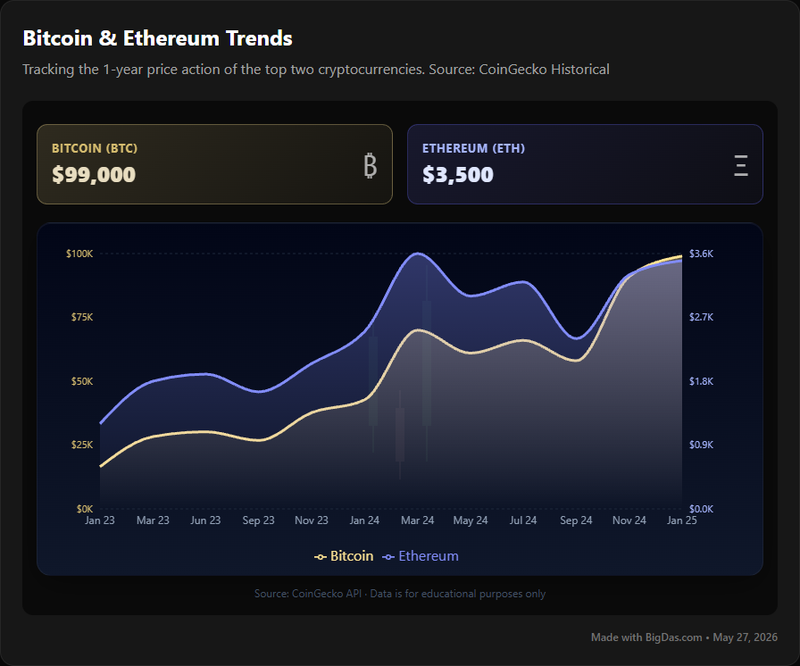
USD Price Trend for Bitcoin and Ethereum: A One-Year Overview
Bitcoin and Ethereum lead the cryptocurrency market by capitalization, so their price action often sets the tone for everything else. Tracking their USD price over a 12-month window gives you a grounded view of how these two assets have moved, where they've corrected, and what patterns have emerged.
The Bitcoin & Ethereum Price History tool shows exactly that: a focused chart of BTC and ETH prices in U.S. Dollars for the trailing year. No forecasts, no live order books, just a clear record of where the market has been.
What the Tool Does
The Bitcoin & Ethereum Price History tool is a price chart that plots the USD value of Bitcoin and Ethereum across the past 365 days. It pulls data from established exchanges and aggregators, then renders it as an interactive line chart.
The one-year window is a deliberate choice. It's long enough to reveal trends and cycles, but recent enough to reflect the current market structure. You get daily or weekly granularity without drowning in multi-year noise.
This is a historical reference, not a trading terminal. It won't generate signals or tell you when to buy. What it does is give you a reliable baseline for your own analysis.
Features
Interactive line chart. Hover over a point to see the exact date and USD price for BTC and ETH.
Trailing 12-month window. Consistent date range that updates as time moves forward, so the chart always shows the most recent year.
USD denomination. All values in U.S. Dollars for straightforward comparison.
Side-by-side and overlay views. Compare the two assets directly, spot correlations, divergences, and lead-lag behavior.
Zoom and pan. Focus on a specific month or quarter without losing context.
Reliable data sources. Prices aggregated from multiple exchanges to reduce single-venue distortion.
Clean interface. No clutter, no required signup. Open the page and read the chart.
How to Use It
1. Open the chart. The default view loads with BTC and ETH plotted over the past year. The x-axis shows time, the y-axis shows USD price, and a legend identifies each line.
2. Hover for exact values. Move your cursor along either line. A tooltip displays the date and closing price for that point.
3. Zoom in on a period. Use your scroll wheel or click-and-drag to isolate a month or week. Useful for examining how a specific news event played out.
4. Compare the two assets. Look at how BTC and ETH move relative to each other. Do they rise and fall together? Does one lead the other during major swings? Are there stretches where ETH outperforms BTC, or vice versa?
5. Mark the inflection points. Note the dates of the year's peak and trough for each asset. Cross-reference those dates with external news (regulation, upgrades, macro events) to build context.
6. Form your takeaway. Write down a sentence or two about what the chart shows. For example: "ETH rallied 40% between March and May while BTC moved sideways." That summary is more useful than any prediction.
Use Cases
Investors and traders. Use the chart to identify historical support and resistance levels, gauge volatility, and calibrate position sizing. The year-long view helps separate short-term noise from sustained trends.
Analysts and researchers. Pull a reliable visual for reports, papers, or presentations. The chart provides a consistent reference for event-impact analysis, for example, comparing price behavior before and after an Ethereum network upgrade or a Bitcoin halving narrative cycle.
Newcomers and educators. See what "volatility" actually looks like in practice. The chart answers basic questions: How much did BTC move this year? When did ETH drop hardest? Visual data is faster to absorb than a spreadsheet.
General observers. Check in on the two largest crypto assets without wading through news feeds. A quick glance tells you whether the year trended up, down, or sideways.
FAQ
Q: What timeframe does "the past year" cover? A: The trailing 365 days, rolling forward from the current date.
Q: Is this real-time data? A: No. It shows historical daily prices, updated at regular intervals. It is not designed for intraday trading.
Q: What currency is used? A: U.S. Dollars (USD).
Q: How accurate is the data? A: Prices come from reputable exchanges and aggregators. Minor variance between platforms is normal; the chart reflects broad market consensus.
Q: Can I export the data? A: Some versions of the tool offer a CSV download. If available, the option appears near the chart.
Q: Does it predict future prices? A: No. It is a historical record only.
Q: Can I view other cryptocurrencies? A: No. This tool covers BTC and ETH only.
Q: Why does price history matter? A: It provides context. You can identify recurring cycles, measure past volatility, and study how the market reacted to specific events. Decisions based on historical data outperform decisions based on guesswork.
Q: Is it useful for day traders? A: Not primarily. Day traders need real-time candlestick charts with order-book data. This tool is better suited for swing traders, position traders, and anyone analyzing medium- to long-term trends.
Summary
The Bitcoin & Ethereum Price History tool delivers a straightforward chart of BTC and ETH prices in USD over the past year. It replaces scattered news headlines and fragmented data with a single, clean visual. Use it to study trends, compare the two assets, and ground your market analysis in actual price history.