
Global Migration Flows

Global Migration Flows: Mapping International Population Movement
People move across borders for many reasons: jobs, family, conflict, climate. The migration data behind these movements is large, fragmented, and constantly changing. Reports usually show a single year's snapshot, which makes it hard to see trends, trace origins and destinations, or understand scale.
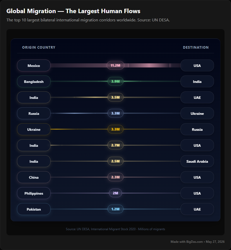
Global Migration Flows is an interactive visualization tool that maps the top international migration corridors. It pulls data from authoritative sources and renders it as flow lines on a world map, so you can see where people are moving, the volume of those flows, and how they have changed over time.
What is Global Migration Flows?
Global Migration Flows is an interactive web tool for mapping the principal international migration corridors. It functions as a dynamic atlas: click a country, adjust filters, and the map updates to show the corresponding immigration flows in and out.
The tool aggregates data from international organizations, national statistical agencies, and academic institutions. It handles both historical and contemporary migration data, so you can examine either long-term global patterns or specific bilateral routes between two countries.
Underneath the map, the tool is an analytical layer over a dataset. Clicking a flow line shows the underlying numbers and the source. This makes it useful for anyone who needs to verify a statistic, build a chart for a report, or just see the spatial pattern of population movement clearly.
Key Features & Benefits
Interactive Global Mapping
- Feature: A high-resolution world map renders
migrationcorridors as dynamic flow lines. Pan, zoom, and click on regions, countries, or individual lines. - Benefit: Geographic context is immediate.
Migrationpatterns become spatial rather than abstract, which makes the distribution ofimmigrationeasier to interpret within ageographyframework.
Customizable Data Filters
- Feature: Filter by origin country, destination country, time period, and (where available) demographic or economic indicators.
- Benefit: Targeted analysis. Researchers, policymakers, and journalists can isolate the slice of data relevant to their question.
Time-Series Visualization
- Feature: Animated timelines or selectable year ranges let you watch
migrationflows change across decades. - Benefit: Trends become visible. You can see which
immigrationcorridors are growing, shrinking, or shifting in response to economic or political events.
Data Detail on Demand
- Feature: Clicking a corridor or country surfaces a panel with migrant counts, origin/destination pairings, and source citations.
- Benefit: Quantitative context is available without leaving the map. This is the primary way to verify the scale of a given
population movementfor reporting or further analysis.
Identification of Top Corridors
- Feature: The map highlights the most significant
migrationcorridors based on the criteria you set (e.g., largest flow in a given year). - Benefit: Major global trends are obvious at a glance, which helps prioritize which
immigrationroutes deserve closer attention.
Export and Sharing Capabilities
- Feature: Export visualized data, raw statistics, or screenshots of custom maps.
- Benefit: Findings can be embedded in reports, presentations, or teaching materials. The output is shareable and reusable, which is the practical side of
data beautiful.
Authoritative Data Sourcing
- Feature: Each data point links back to a source from a recognized international body, national statistical office, or academic institution.
- Benefit: Trust. Users can confirm they are working with vetted
population movementdata and review the methodology behind theimmigrationnumbers.
How to Use It
Step 1: Access the Platform
- Open the Global Migration Flows tool in a web browser.
- On load, you will see a world map with default
migrationflows displayed.
Step 2: Understand the Interface
- The Map: The main visualization area.
Migrationcorridors appear as lines or arrows between countries. Thickness or color encodes flow volume. - Navigation Controls: Standard map controls: zoom (+/− or scroll), pan (click and drag), and a reset view button.
- Legend: Explains what colors, line weights, and symbols mean.
- Control Panel: Usually on the side or top; contains filters and time selectors.
Step 3: Select and Filter Data
- Choose a time period: Use the time slider or year selector. Watch how
migrationpatterns change. - Focus on a country or region: Click a country on the map to see its inbound and outbound
immigrationflows, or use the search box in the control panel to highlight a specific corridor. - Filter by flow volume: If available, use a slider to focus on either the highest-volume
population movementor smaller, less obvious flows.
Step 4: Interpret the Visualizations
- Line thickness and color: Heavier or darker lines indicate larger
migrationvolumes. - Direction: Arrows show the direction of
immigrationflow (origin to destination). - Detail panels: Clicking a corridor or country opens a panel with exact migrant counts, the year, and source citations. This is where the map's visual layer becomes quantitative data.
Step 5: Advanced Exploration
- Compare trends: Use the time-series feature to animate the map or jump between years.
- Layer additional data: Some versions allow demographic or economic overlays for added context.
- Export: Download raw data (CSV, Excel) or save a static image of the map for reports or presentations.
Step 6: Keep Learning
- Built-in help: Check for tutorials, FAQs, or help guides inside the platform.
- Experiment: Try different filter combinations. Most useful insights come from iterative exploration of the
geographyofpopulation movement.
Use Cases
For Researchers and Academics
- Test hypotheses about the drivers and directions of
migrationagainst real data. - Spot under-researched corridors or emerging
population movementtrends. - Build visuals for papers, conferences, and lectures.
- Track
immigrationpatterns over decades to study long-term demographic shifts.
For Policy Makers and Government Officials
- Inform
immigrationand integration policy using source-country and destination data. - Allocate resources for border management and public services where
population movementis concentrated. - Inform bilateral
migrationnegotiations and international cooperation. - Monitor sudden flow shifts that may signal humanitarian or geopolitical crises.
For NGOs and Humanitarian Organizations
- Identify primary
migrationroutes and concentration points to direct aid, medical support, and refugee assistance. - Use
data visualizationto advocate for migrant rights and raise public awareness. - Plan programs around the specific
immigrationchallenges of populations along particular corridors.
For Journalists and Media Professionals
- Back up
migrationstories with verifiable data and source citations. - Fact-check claims about
immigrationandpopulation movement. - Embed interactive or static maps in articles and broadcasts to give the
geographyofmigrationa visual anchor.
For Educators and Students
- Turn
geography, demography, and social studies into interactive lessons. - Give students a platform for independent research into
population movementandimmigrationpatterns. - Show how
migrationshapes economies, cultures, and political systems worldwide.
For Businesses and Economists
- Track
immigrationtrends to understand labor supply and shifts in workforce demographics. - Identify regions with significant
population movementas potential consumer markets or talent pools. - Assess geopolitical or economic risk tied to large-scale
migrationor corridor disruption.
Frequently Asked Questions (FAQ)
What kind of data does Global Migration Flows use?
The tool aggregates data from national statistical offices, UN agencies (UNDESA, UNHCR, IOM), the World Bank, and academic institutions focused on migration and population movement. The goal is to provide the most comprehensive and authoritative immigration data available.
How frequently is the data updated?
Update frequency depends on the primary sources. Migration data is usually published annually or biannually, and there is typically a one- to two-year lag between collection and publication. Tool features may update more often than the underlying migration statistics.
Is Global Migration Flows free to use?
Many global migration visualization platforms are publicly funded and free. Some specialized features may be part of a paid tier. Check the platform's About or Pricing page for specifics.
Can I download the raw data or export customized maps?
Usually, yes. Look for Download, Export, or Share options. Common formats include CSV or Excel for raw migration data, and PNG or SVG for the customized data beautiful maps.
What is a "migration corridor"?
A migration corridor is a well-established route of population movement between an origin country and a destination country or region. Corridors are defined by consistent and often large immigration flows, typically driven by historical ties, economic gaps, diaspora networks, or geography. The tool focuses on the largest of these international corridors.
How accurate is the data?
Accuracy depends on the primary sources. The tool draws from institutions that use rigorous statistical methods, but international migration statistics are inherently noisy: definitions and collection methods differ across countries, and undocumented population movement is hard to measure. Each data point is cited so users can review the context and limitations.
Can I contribute data or suggest improvements?
Look for a Contact or Feedback link. Direct data contributions are usually limited to official bodies, but feature suggestions and bug reports are generally welcome.
Conclusion
Global migration shapes economies, politics, and cultures across every continent. Raw counts alone do not communicate that; you need geographic context and a way to compare across time.
Global Migration Flows provides that. It maps the top international migration corridors, surfaces the underlying immigration data on demand, and tracks how population movement has evolved. For policy, humanitarian work, research, journalism, or classroom teaching, it is a direct way to engage with the geography of human mobility using current data.